12 Components to Implement a Successful SaaS Web Design (with examples)

An increasing number of organisations are investing in SaaS products due to how viable and cost-efficient they can be. This means more and more SaaS businesses are coming up in Google rankings, with their websites competing fiercely for the first page of search results. B2B web design is thus crucial for your online visibility.
With this in mind, your website must provide an outstanding user experience that hooks visitors and keeps them around, thus increasing traffic, your website’s ranking, and ultimately conversions.
In this article, we have compiled 12 components of the best B2B SaaS website designs which you can incorporate to improve your website’s UX and, with it, your conversions.
Category 1: Visual design
They say first impressions are important, and that goes for B2B SaaS website designs too. Visual design is the first contact point between you and your potential leads, so it plays a crucial role in whether visitors stay or leave. When done right, visual design conveys your value proposition, evokes emotions, builds trust, guides the user experience, and drives action – all of which adds up to increase conversions. On the other hand, a cluttered or unintuitive website creates confusion and drives visitors away.
But what makes good visual design? The answer is a combination of various elements. Let’s review each of them with concrete SaaS examples:
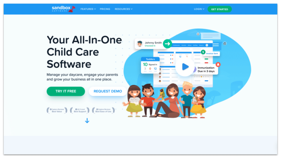
1. Illustrations
Illustrations show your creativity and help build a memorable brand. By thinking about your target customers, and aligning your style and imagery to that demographic, you can create emotional connections using visual aesthetics that demonstrate what your brand is all about far more effectively than copy alone (or stock images). Illustrations also create effective and eye-catching ways to highlight product features and explain the value that you provide.
Example: Sandbox Software makes use of cute illustrations that speak to the target customers (daycare owners) and help explain the core features.
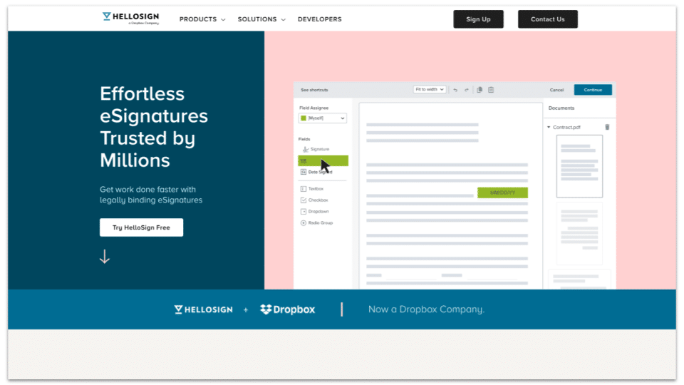
2. Split screen design
The split-screen design divides a screen into two sections or more (e.g. two images, one image, and a paragraph of text, etc.). It adds visual appeal and presents content in a clear and organised way.
Pro tip: Make sure that your design looks good on all platforms and devices. A split-screen that doesn’t translate well to mobile, for instance, will hinder conversions instead of increasing them.
Example: HelloSign splits the hero section to state its value proposition and show a glimpse of how it works before the visitor scrolls down.
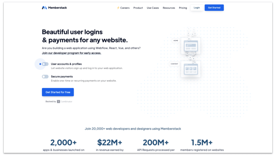
3. Interactive
Interactivity in web design means actively engaging visitors via features they can interact with, like buttons, forms, hover states, scroll-triggered animations, videos, chatbots, and more. These interactive elements create a satisfying UX (user experience) and compel visitors to spend more time browsing your website. Just make sure that they are mobile-friendly and that your content management system can support them.
Example: MemberStack features toggles on the left that can change the animation on the right to showcase how paid memberships work. You can also play with other toggles below to set up login and checkout forms.
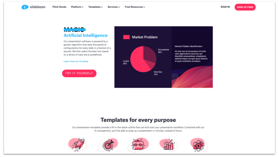
4. Colour palette
Effective websites use a colour palette to catch attention, create desire, and drive action. When used strategically, colours can guide the user experience and highlight key points. To make the most out of colours, consider studying the psychology of colours and using white space as well as contrasts to keep your design clean and tidy.
Example: SlideBean uses a bright cyan colour to highlight the USP and a pink CTA button that can’t be missed.
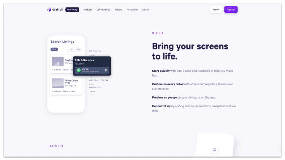
5. Long-form homepage
A long-form homepage can communicate everything that visitors need to know to take action, from the product features and benefits to social proof, without having to browse multiple pages – which can lead to slow load times and friction in the UX, thus making visitors leave. Keeping their attention focused on one long-form page helps detail your value proposition while encouraging conversion.
Example: Draftbit’s homepage shows you what their platform enables — building an app from your browser – and by the end of the page you have a crystal-clear idea of how it works and why it’s convenient.
Category 2: Content Design
No SaaS website is complete without effective content. Your website copy and content must work in tandem to grab the attention of visitors, explain what your solution does, build interest, and motivate your target audience to try it. Effective content is informative yet punchy — it communicates the benefits of using your software in a concise and engaging way.
Here are three ways you can use content to convert visitors into leads and then into customers —
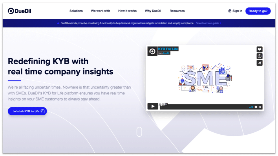
1. Direct-response copy
In order to grab the attention of your audience quickly and effectively, you need to put a lot of care and effort into creating direct copy that prompts a response or action from your visitors. The copy has a purpose, and that is to convert visitors. Direct-response copywriting is a surefire way to elevate the conversion rate of your site and boost traffic.
Example: DueDil, the homepage tells you the USP right off the bat and invites you to sign up for a free guide immediately. DueDil then explains why their platform is worth investing in using simple subheadings and short paragraphs supported by strong visuals. The straight-to-the-point messaging is reinforced by appealing images, social proof, and microcopy for bold buttons.
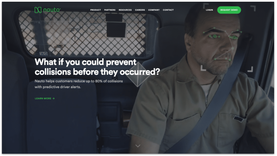
2. Video content
Producing video content allows your business to create versatile and engaging content that not only delivers a real-life snapshot of your product, but it is also transferable across myriad channels. Not least consumers like it because it’s easily digestible and more easily made entertaining — marketers like it because it offers a potentially huge ROI (return on investment).
Example: Nauto, this company’s website plays a video in the background of its hero section to show visitors their innovative technology in action – real-time distraction alerts for drivers. The video quickly establishes Nauto’s value as a literal life-saver.
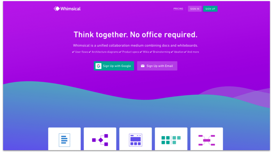
3. Personality/unique content
Giving your content personality and visual quirks goes a long way to make your brand stand out. The way content is presented helps set the brand apart from competitors, especially in an industry where products can be perceived as technical and dull, with the raving reviews serving as the cherry on top.
Example: Whimsical note how the site greets you with a big, bold colour splash, creating a whimsical and bright welcome for your visitors. Crucially, engaging them visually, so that you can then capture them with your actual product.
Category 3: Conversion Top Tips
Conversion is the whole point of a SaaS (or arguably any) website. If your website is not good at lead generation, nurturing, and conversion, then its web design must be reviewed and updated. Luckily, there are tips you can apply to optimise conversion rates —
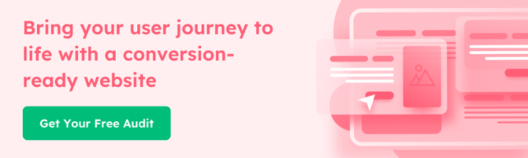
Want to see where your website can improve? 🚀
Get a FREE Audit today from us to receive an objective review of your website, as well as suggestions to optimise your approach.
1. Personalisation
Typically, if you dig into your web traffic, the visitors will formulate specific visitor segments. If you undertake this research, you’ll soon realise you have many different kinds of visitors — from age group to location and level of influence. You need to be able to capture each visitor’s specific interest — like the exact pain points they care about — then you’ll have a higher conversion rate.
Example: Clearbit, website visitors are more likely to convert when a website displays information that’s specific to them. When you submit your email address to request a demo from Clearbit, their website pulls information like your company’s name and logo to personalise the homepage for the next time you visit it. This nice touch demonstrates how Clearbit uses data to understand customers, making its value proposition more palpable.
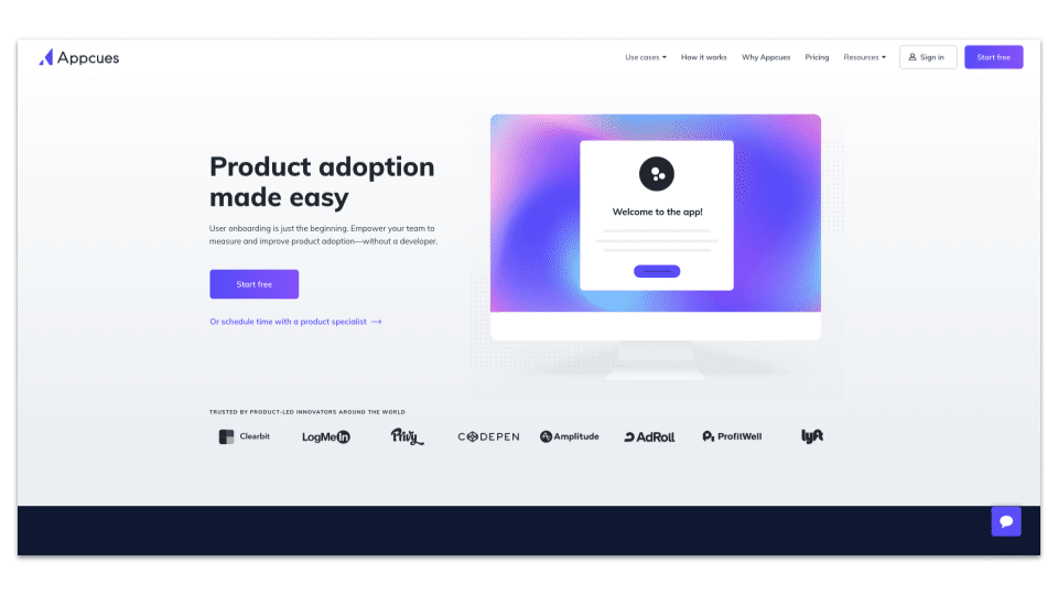
2. Value Proposition on the homepage
Your website is a crucial part of creating your digital presence, it can be difficult to determine what takes centre stage on the homepage. But ultimately, your value proposition needs to be included in the homepage — it’s the job of a business’s website to deliver this value proposition, and it should be concise and clear. After a few minutes of being on your site, people should know the value you bring.
Example: Appcues, their website wastes no time stating a clear value proposition and backing it up with customer logos, metrics, and testimonials. Each main feature is explained with concise copy and images.
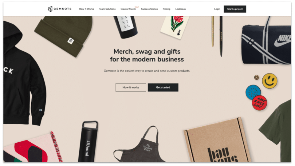
3. Ghost/Filled Buttons
This feature is a great tactic you can deploy to drive conversions. Your visitor’s eyes will be immediately drawn to the filled button that can be a link to a direct conversion CTA, and the ghost one can link to a product demo or an explanation of sorts. Giving your visitors a directed and frictionless UX.
Example:Gemnote is a great example of this. The hero section uses a combination of a filled and a ghost button to increase conversions. The filled button, which you notice first, is a straightforward call to action, while the ghost (transparent) button provides access to more information if you want it.
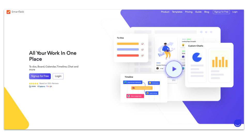
4. Social Proof
We’ve mentioned social proof a couple of times already because of how tremendously persuasive it can be. It is a great tool to deploy that can generate brand loyalty, customer trust and boost visitor accessibility to true product understanding. But, you need to make sure you don’t sound like you’re bragging!
Example: SmartTask proudly mentions “trusted by over 20,000 teams” and displays customer logos. Plus, the customer testimonials near the bottom of the homepage do a great job of reinforcing credibility.
Final Thoughts
Successful SaaS web design hinges on a variety of components, from appealing visuals to a compelling value proposition, engaging content, personalisation, social proof, and more.
While these elements are numerous, you don’t have to adopt every single one – you just have to find what works for your product. But SaaS web design is complex and there are many options and tactics that may or may not be a good fit for you. The good news is that working with an agency can help you find the right web design strategy without trial and error. At Gripped, we work with SaaS companies to make their websites successful at driving conversions. Get in touch today and we will help you get started.
Reach Your Revenue Goals. Grow MRR with Gripped.
Discover how Gripped can help drive more trial sign-ups, secure quality demos with decision makers and maximise your marketing budget.
Here's what you'll get:
- Helpful advice and guidance
- No sales pitches or nonsense
- No obligations or commitments


Book your free digital marketing review
 30 min session
Other Articles you maybe interested in
Top B2B Web Design Agency Options in 2025
B2B web design agencies play a crucial role in helping businesses stand out against competitors, engage their audience, and generate leads effectively. Your website is at the centre of your digital go-to-market strategy, and selecting the right partner can be the difference between a stagnant web presence and one that drives your growth. Here are…

How Much Does a Website Agency Cost in 2025?
Your website sits at the centre of your marketing strategy and sales process — and if it doesn’t, it should. Your website needs to do more than provide a good user experience and some information about what you do. In 2025, your website needs to reach your audience, drive leads and convert. If it’s not…
What is a Google Analytics Landing Page?
Measuring how your website visitors behave is important. By understanding their behaviour, you can make critical and well-informed changes to how your website, campaigns and calls-to-action are structured, planned and executed. Within Google Analytics, you can use Landing Pages to optimise your first interactions with website visitors in a way that has proven most profitable…