The 100 Best SaaS Websites Examples to Get Inspiration (Updated for 2025)

It’s undeniable that a well-executed website is a deal breaker for a customer looking to invest in a B2B SaaS brand. Getting the balance between eye-catching content and practicality is no small feat, but it will make all the difference in attracting potential customers — something the best SaaS websites on this list have nailed.
Your B2B SaaS website is often the first impression potential customers have of your brand. If it’s unclear, overloaded, or fails to show genuine value, you could lose new leads before they even understand what you offer. In contrast, the best SaaS websites get straight to the point. They pack eye-catching design, user-friendly navigation, and real-world proof into a single online experience—guiding buyers from interest to purchase in just a few clicks.
Achieving that balance isn’t easy. It demands endless choices around layout, messaging, calls to action, and more. But if you’re aiming to grow faster and convert quality leads, understanding what top-performing SaaS brands do well is essential. To help you get started, we’ve handpicked standout examples of B2B SaaS sites that seamlessly merge strategy and creativity. By following their lead, you’ll set your website apart, draw in your ideal audience, and ultimately boost your bottom line. Let’s dive in.
1. Slack (Unchanged from last year)
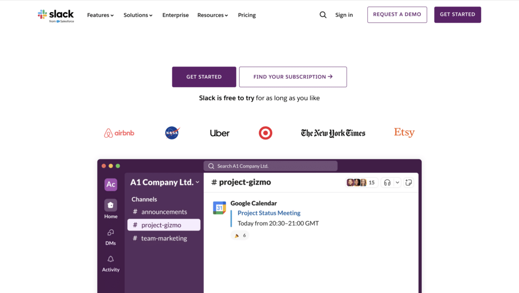
Slack is a communication tool that boosts efficiency for businesses of all sizes.
What are their standout website features?
They highlight Slack’s core function from the start, showing how it differs from email. A product-led approach includes a “see all features” call to action, plus a short video leveraging the fact that people spend 88% more time on pages with video.
Takeaways to upgrade your website with:
- Include calls to action throughout the homepage
- Highlight your product’s value and USP early
- Keep messaging simple and concise
- Use short videos or animations to demonstrate key features
2. Gainsight (Up from #16)
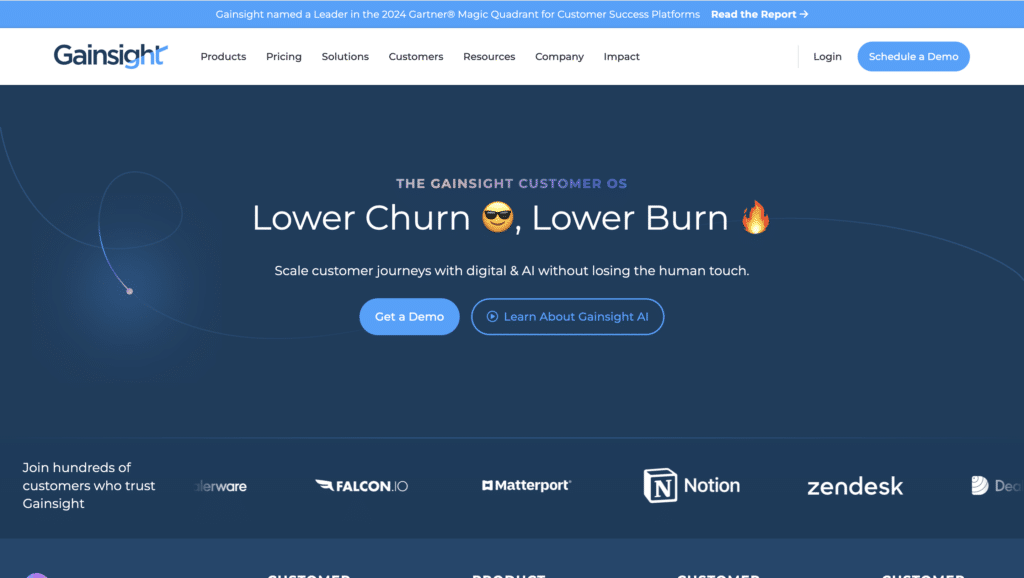
Gainsight is a customer success platform that helps businesses retain customers and drive growth.
What are their standout website features?
The homepage explains how proactive customer success can boost retention. Concise case studies with charts show increased revenue, while clear calls to action guide visitors to demos or success webinars.
Takeaways to upgrade your website with:
- Begin with a brief, benefit-focused explanation
- Use simple data visualisations to highlight results
- Place calls to action in obvious, easy-to-find spots
- Offer webinars or resources for deeper insights
3. Stripe (Down from #2)
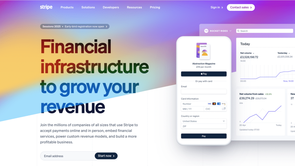
Stripe is a leading payment platform serving tech-savvy businesses worldwide.
What are their standout website features?
They have a bold, minimalist homepage that targets developers and finance teams. Interactive payment flow demos let users see exactly how Stripe works. Their documentation is well-structured for quick starts.
Takeaways to upgrade your website with:
- Keep copy concise and aimed at core audiences
- Provide interactive product demos
- Organise documentation for quick reference
- Maintain a clean layout pointing to key actions
4. HubSpot (Up from #6)
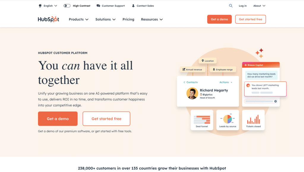
HubSpot is an all-in-one platform for marketing, sales, and customer service.
What are their standout website features?
They tailor the homepage for different user types (marketing, sales, service). The site blends how-to guides with product highlights, and free tools or demos are clearly promoted to remove barriers.
Takeaways to upgrade your website with:
- Personalise the homepage for different buyer personas
- Combine educational resources with product promos
- Offer free tools or demos as the next step
- Keep navigation intuitive
5. Airtable (Down from #3)
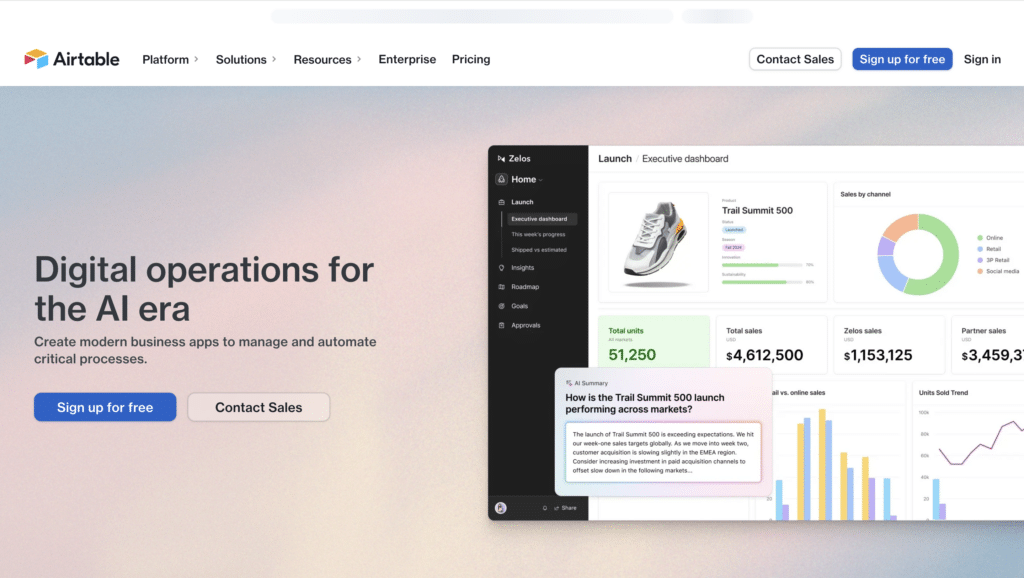
Airtable is a spreadsheet-database hybrid for teams seeking user-friendly data organisation.
What are their standout website features?
The site is bright and visually appealing, offering templates for different use cases. It also personalises content for returning visitors by suggesting workflows and templates, making the experience feel tailored.
Takeaways to upgrade your website with:
- Provide ready-made templates to showcase value quickly
- Use friendly, welcoming design elements
- Tailor content to different visitor segments
- Keep copy short and direct
6. Monday.com (Down from #4)
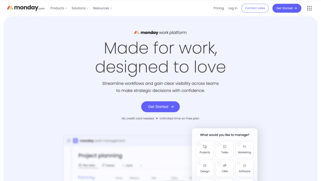
Monday.com is a work management platform known for its colorful interface and easy-to-use workflows.
What are their standout website features?
They place a product demo at the top of the homepage so users can see the tool in action right away. Clear navigation, bold visuals, and minimal text keep it simple. Fast loading times improve the user experience.
Takeaways to upgrade your website with:
- Put a product demo above the fold
- Use bright visuals to grab attention
- Keep copy short
- Ensure quick load times for a smooth experience
7. Intercom (Unchanged from last year)
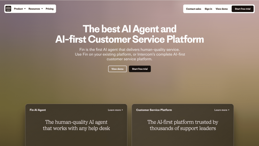
Intercom offers messaging tools and chatbots for customer support and engagement.
What are their standout website features?
A crisp design highlights live chat and chatbot features. They show how their bot adapts to different industries, and short case studies prove real-world value without overwhelming text.
Takeaways to upgrade your website with:
- Match product features to each user’s industry
- Keep design minimal and focused
- Include short success stories
- Focus on quick, relevant user interactions
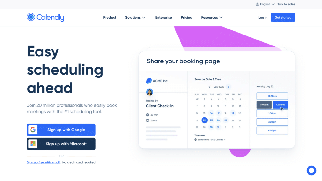
8. Calendly (Up from #9)
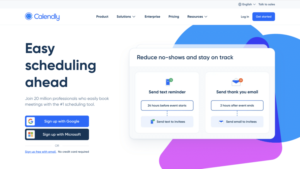
Calendly is a scheduling tool that eliminates the back-and-forth of booking meetings.
What are their standout website features?
They present a single, clear promise: reduce admin time. The setup process is simple, and short demo videos show how Calendly integrates with popular calendars and apps.
Takeaways to upgrade your website with:
- Focus on one core benefit (time saved)
- Keep layout minimal and uncluttered
- Use short videos to explain integrations
- Simplify sign-up and onboarding steps
9. Notion (Up from #10)
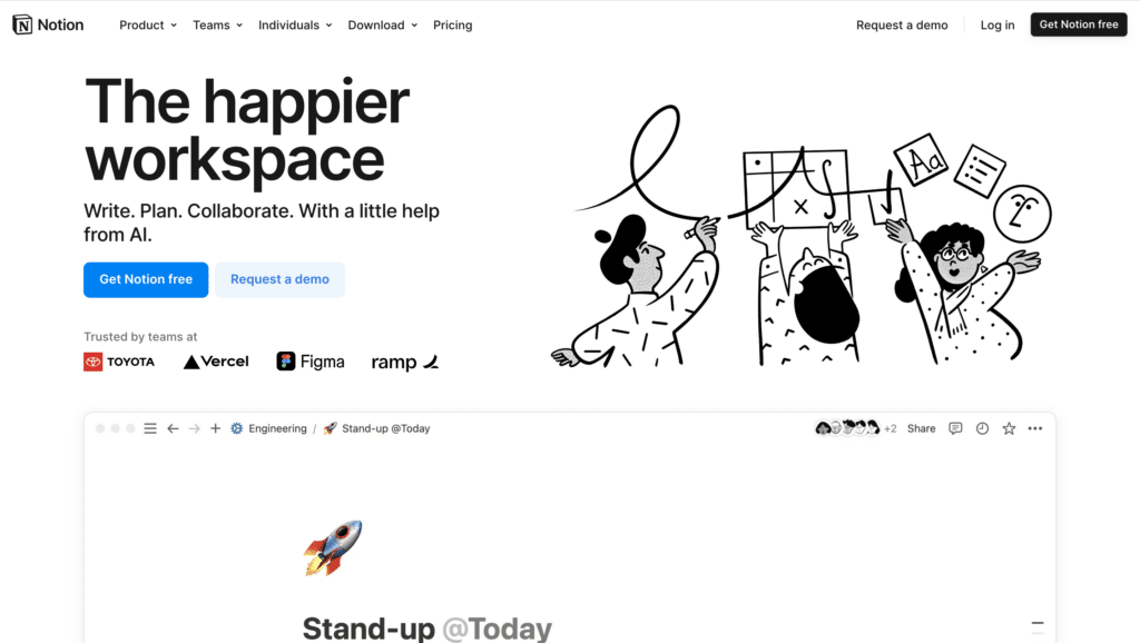
Notion is an all-in-one workspace for notes, projects, and databases.
What are their standout website features?
They use a clean interface with large icons and ample white space. The homepage quickly covers project planning, writing, and knowledge-base features. A community-driven template gallery makes onboarding even faster.
Takeaways to upgrade your website with:
- Keep design light to avoid overwhelming visitors
- Highlight multiple use cases in concise sections
- Encourage community involvement and shared templates
- Maintain a friendly, approachable tone
10. Clay (New entrant)
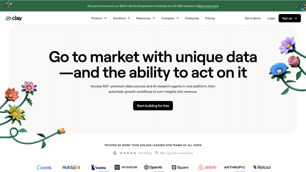
Clay is a personal relationship manager that centralises contacts, insights, and interactions.
What are their standout website features?
They focus on thoughtful relationship management, using a sleek, minimal design. By syncing with email, calendars, and social networks, Clay automates data entry and keeps everything in one place.
Takeaways to upgrade your website with:
- Spotlight a clear core promise (better relationship management)
- Use a simple, friendly layout
- Show how the product automates repetitive tasks
- Offer visuals or demos to explain key features
11. Asana (Up from #15)

Asana helps teams plan and track projects, keeping everyone on schedule.
What are their standout website features?
They present colourful, interactive timelines showing how tasks and milestones connect. Quick success stories from different sectors illustrate Asana’s flexibility.
Takeaways to upgrade your website with:
- Use engaging visuals to explain workflows
- Include concise customer stories for proof
- Provide step-by-step breakdowns for clarity
- Tailor messaging to different industries if possible
12. Webflow (Up from #14)
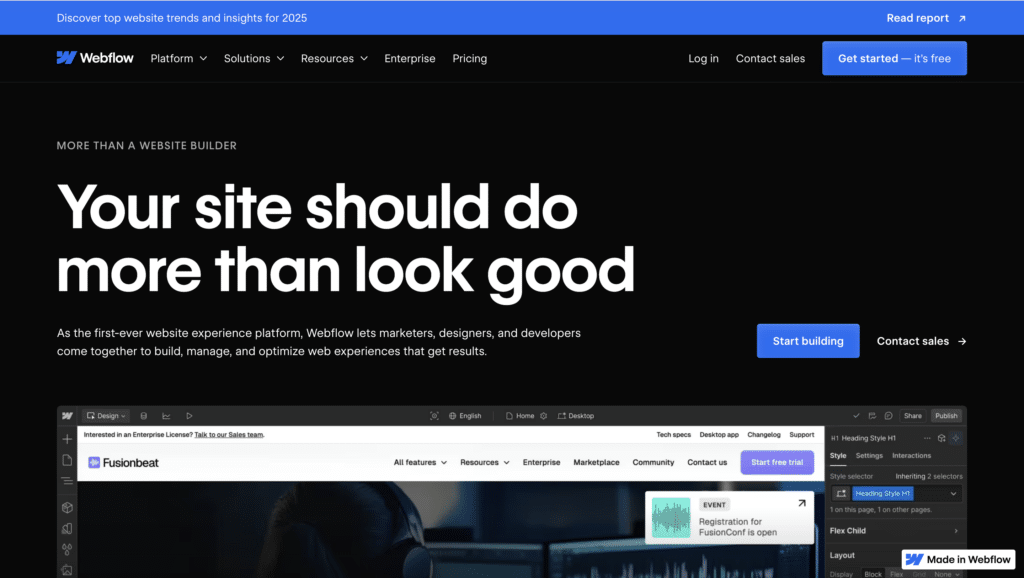
Webflow lets users design, build, and launch websites without coding expertise.
What are their standout website features?
They show real sites made by users to prove capabilities. A live design demo is embedded in the homepage, letting visitors experiment straight away. They also emphasise community resources and support.
Takeaways to upgrade your website with:
- Use real-world examples to showcase your product’s power
- Include a hands-on demo to encourage exploration
- Highlight community-driven resources
- Keep the tone beginner-friendly
13. Gong (Down from #11)
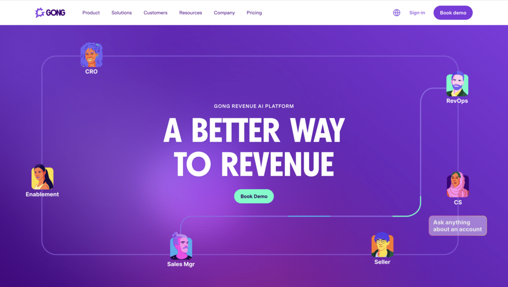
Gong is a revenue intelligence platform that analyses customer interactions for sales insights.
What are their standout website features?
They start with a clear statement on how they enhance sales outcomes. An ROI calculator plus short video case studies back up their claims. Bright, bold visuals match their energetic brand voice.
Takeaways to upgrade your website with:
- Begin with a strong statement on your main benefit
- Use ROI tools or demos to support claims
- Offer short videos for fast engagement
- Maintain bold, consistent branding
14. Snowflake (Unchanged from last year)
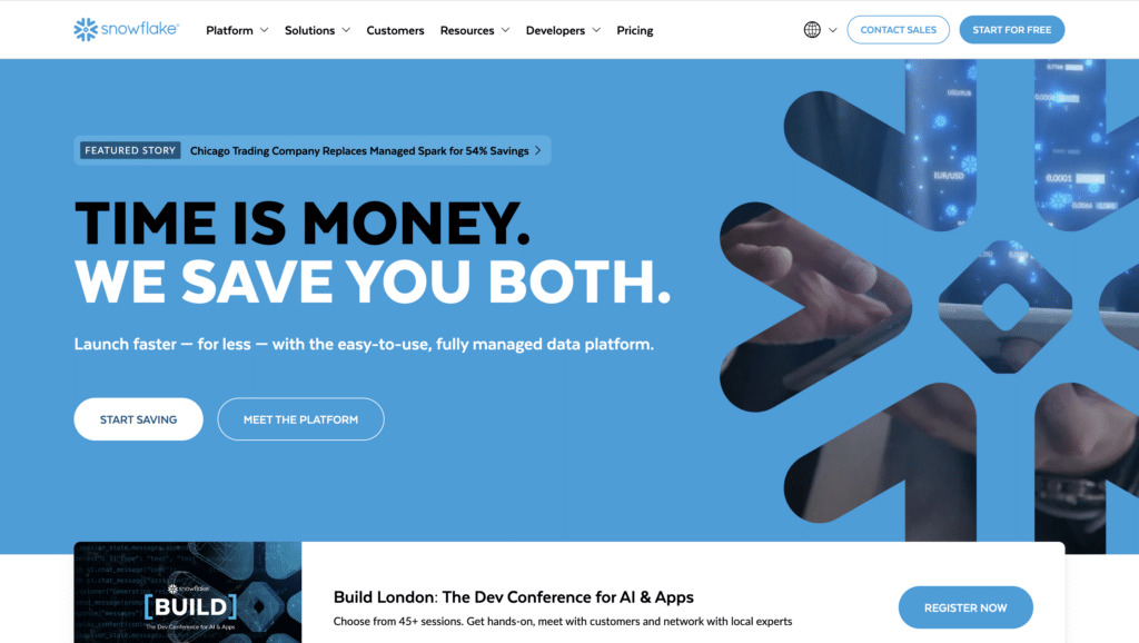
Snowflake is a data cloud platform for companies handling large-scale analytics.
What are their standout website features?
They keep it straightforward: data storage, fast analytics, and secure collaboration. Real metrics show time saved or cost reduced. Simple cloud architecture diagrams convey complex tech in a user-friendly way.
Takeaways to upgrade your website with:
- Use clear, benefit-led messaging
- Include measurable data in customer examples
- Employ easy-to-read diagrams for complex processes
- Stress reliability and security if relevant to your audience
15. Segment (Up from #30)
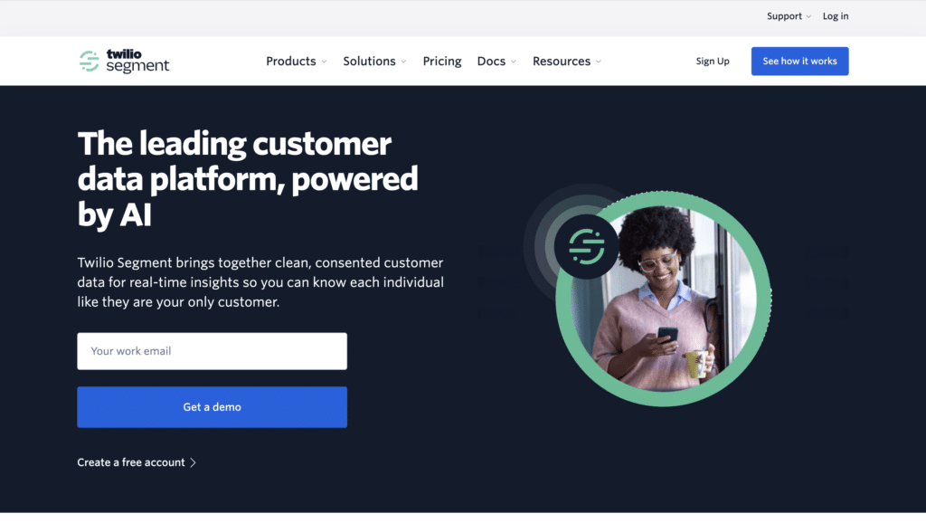
Segment is a customer data platform for collecting, unifying, and routing user data.
What are their standout website features?
Bright icons and diagrams show how data flows between tools. They highlight integrations that reduce manual data wrangling. Short, results-oriented case studies reinforce real business gains.
Takeaways to upgrade your website with:
- Use icons or graphics to simplify data pipelines
- Emphasise easy integrations with popular platforms
- Share success stories backed by stats
- Keep the homepage concise and direct
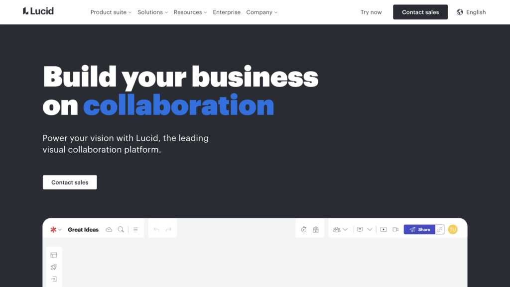
16. Lucidchart (Up from #17)
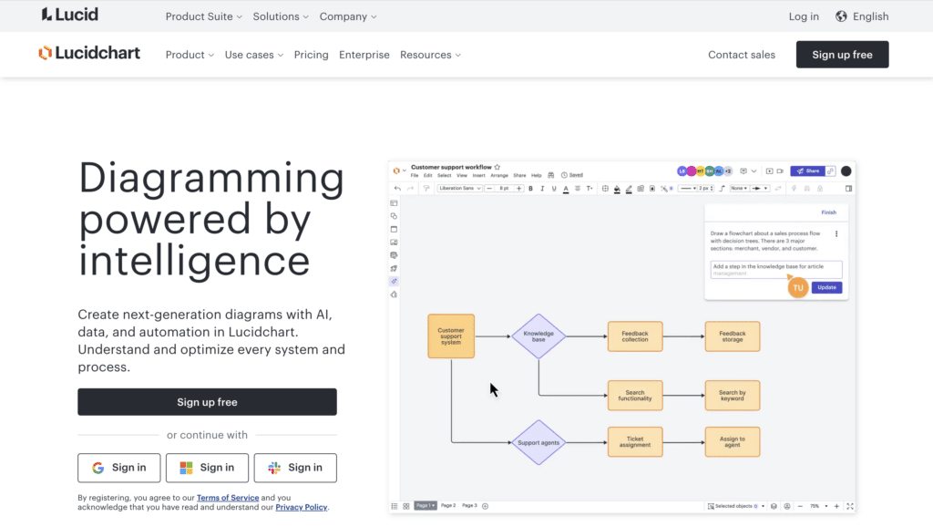
Lucidchart is a visual workspace for creating flowcharts, diagrams, and process maps.
What are their standout website features?
They highlight specific use cases for multiple roles, from API planning to sales org charts. A crisp set of diagrams and a sandbox demo on the homepage let visitors play around immediately.
Takeaways to upgrade your website with:
- Showcase role-based use cases for wider appeal
- Use bold visuals to clarify complex concepts
- Offer a hands-on sandbox for testing features
- Supply templates for quick starts
17. Miro (New entrant)
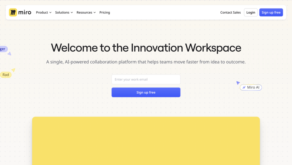
Miro is a collaborative online whiteboard for remote brainstorming, workshops, and project planning.
What are their standout website features?
Short videos demonstrate how teams collaborate in real time. Ready-made templates for tasks like brainstorming or retrospectives speed up onboarding. Bold colours and friendly icons keep the design lively.
Takeaways to upgrade your website with:
- Show collaboration in action through short clips
- Offer templates for quick starts
- Use bright visuals to encourage interaction
- Emphasise real-time demos if teamwork is central
18. Trello (Down from #12)
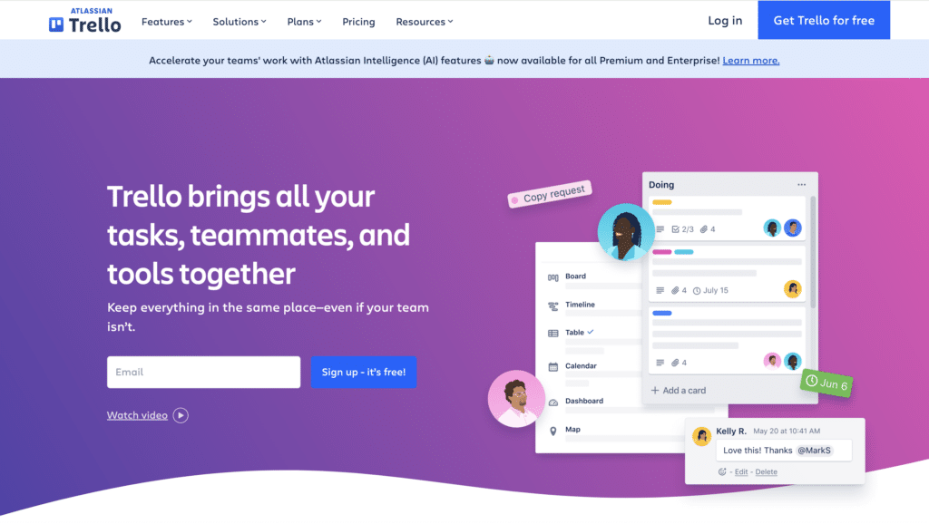
Trello is a project management tool built on visual Kanban boards.
What are their standout website features?
They keep design straightforward, with drag-and-drop cards and plain language. It suits personal to enterprise tasks. Their Butler automation saves time on repetitive actions.
Takeaways to upgrade your website with:
- Use boards and cards to visualise tasks
- Adopt simple language for broader appeal
- Highlight automation to streamline repetitive work
- Offer examples for various usage scenarios
19. Freshworks (Unchanged from last year)
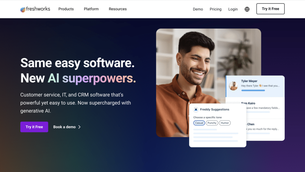
Freshworks provides a suite of SaaS tools for customer service, sales, and IT support.
What are their standout website features?
They group products under clear headings like Freshdesk or Freshsales, each with short intros focused on benefits. Bright visuals and icons keep it welcoming, and success stories mention metrics like faster response times.
Takeaways to upgrade your website with:
- Organise products by function or user role
- Use upbeat visuals and icons for a friendly feel
- Include data in customer success stories
- Maintain consistent layout across product pages
20. Zapier (Unchanged from last year)
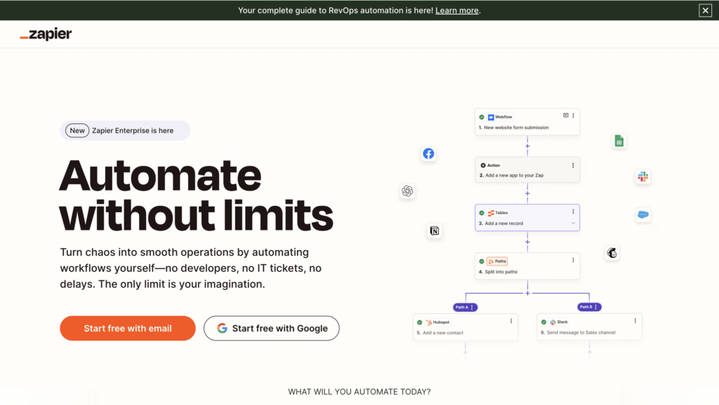
Zapier is an automation platform connecting apps and workflows without coding.
What are their standout website features?
They emphasise saving time right from the start. An interactive “Connect this app…” box prompts exploration, and a library of pre-built “Zaps” simplifies adoption.
Takeaways to upgrade your website with:
- Lead with the main benefit (time-saving)
- Use interactive elements to spark curiosity
- Offer pre-made workflows for quick wins
- Keep sign-up steps minimal
21. Brevo (Up from #22)
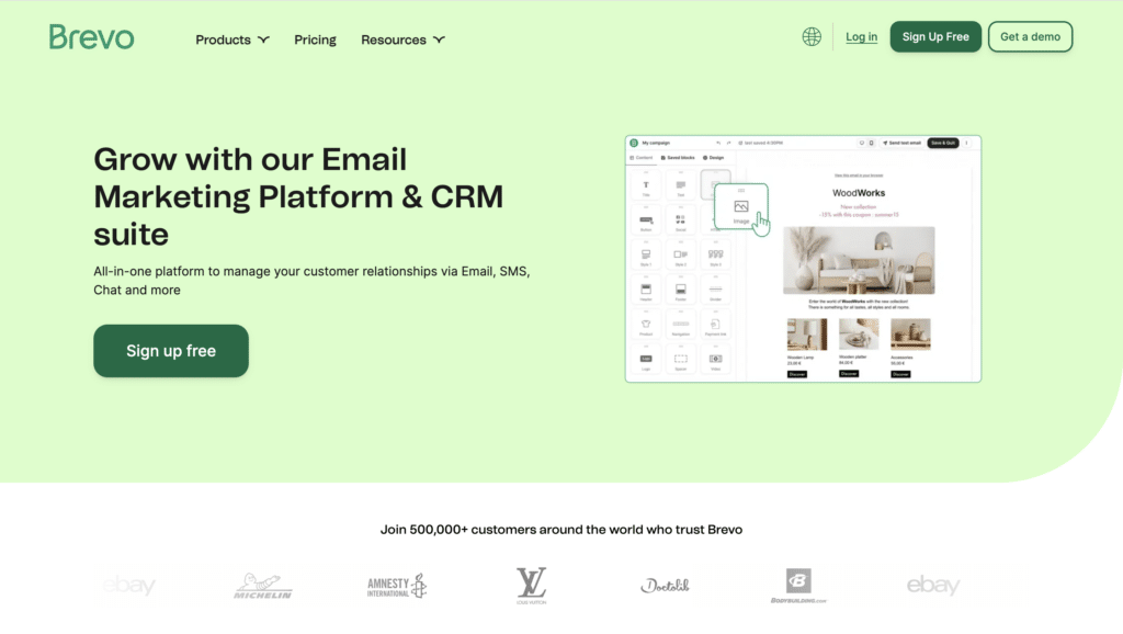
Brevo (formerly SendinBlue) is a multichannel marketing platform covering email, SMS, and automation.
What are their standout website features?
They centralise different marketing channels in one interface. A prominent free trial CTA makes onboarding easy. Testimonials mention open rates and conversions, backed by data.
Takeaways to upgrade your website with:
- Combine multiple channels into a clear, unified message
- Keep your free trial CTA highly visible
- Provide testimonials with real metrics
- Ensure pricing is transparent and easy to compare
22. Pipedrive (Up from #23)
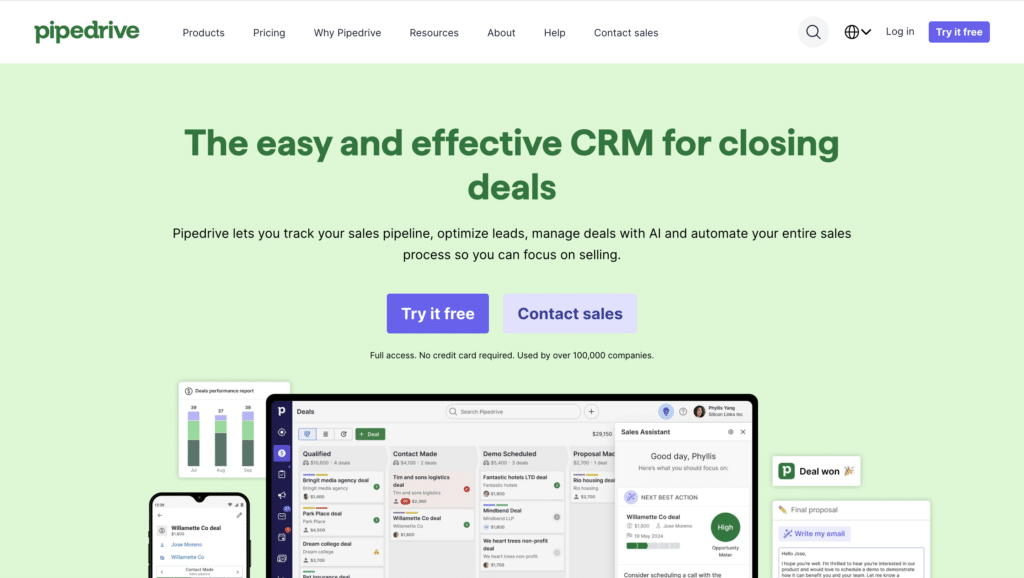
Pipedrive is a sales CRM tool geared towards small and midsize teams.
What are their standout website features?
They open with a bold statement promising more closed deals. Screenshots clarify what the pipeline looks like, and data on conversion boosts underscores the product’s impact. Sign-up is quick to suit busy reps.
Takeaways to upgrade your website with:
- Start with a strong, outcome-led headline
- Show interface previews or screenshots
- Back up promises with numerical evidence
- Keep onboarding short and intuitive
23. Typeform (Down from #21)
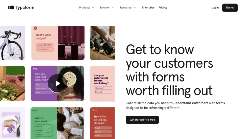
Typeform creates interactive forms and surveys that feel like casual conversations.
What are their standout website features?
They showcase a playful design that increases form completion rates. Device previews assure users that forms look great everywhere. Integrations with CRM and email tools boost data flow.
Takeaways to upgrade your website with:
- Use a friendly, conversational design
- Show device compatibility to reassure users
- Highlight key integrations for smoother workflow
- Prioritise user experience to prevent drop-offs
24. SurveyMonkey (Up from #25)
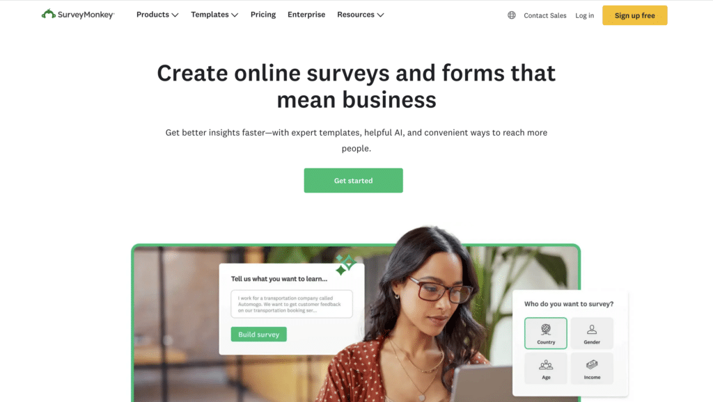
SurveyMonkey is a survey platform for gathering feedback from customers, employees, and more.
What are their standout website features?
They have pre-built templates for everything from market research to employee engagement. The homepage underscores fast survey creation and data collection. Big-name clients provide social proof.
Takeaways to upgrade your website with:
- Offer multiple templates to speed up survey creation
- Emphasise quick setup and results
- Highlight well-known clients for trust
- Use accessible design for broad audiences
25. Wrike (Down from #26)
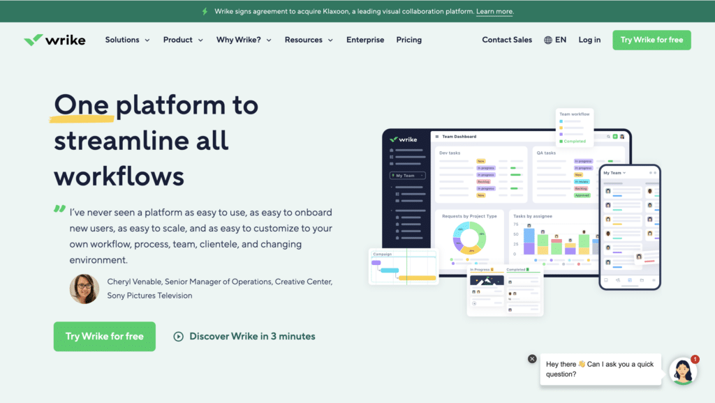
Wrike is a project management and collaboration tool for agile teams and large enterprises.
What are their standout website features?
They display dynamic timelines to visualise tasks, deadlines, and resources in real time. Different landing pages address marketers, creative teams, and IT. Enterprise logos add credibility.
Takeaways to upgrade your website with:
- Segment content by user role or department
- Use visuals to clarify complex workflows
- Show well-known brand logos for trust
- Emphasise agility and scalability
26. Crisp (New entrant)
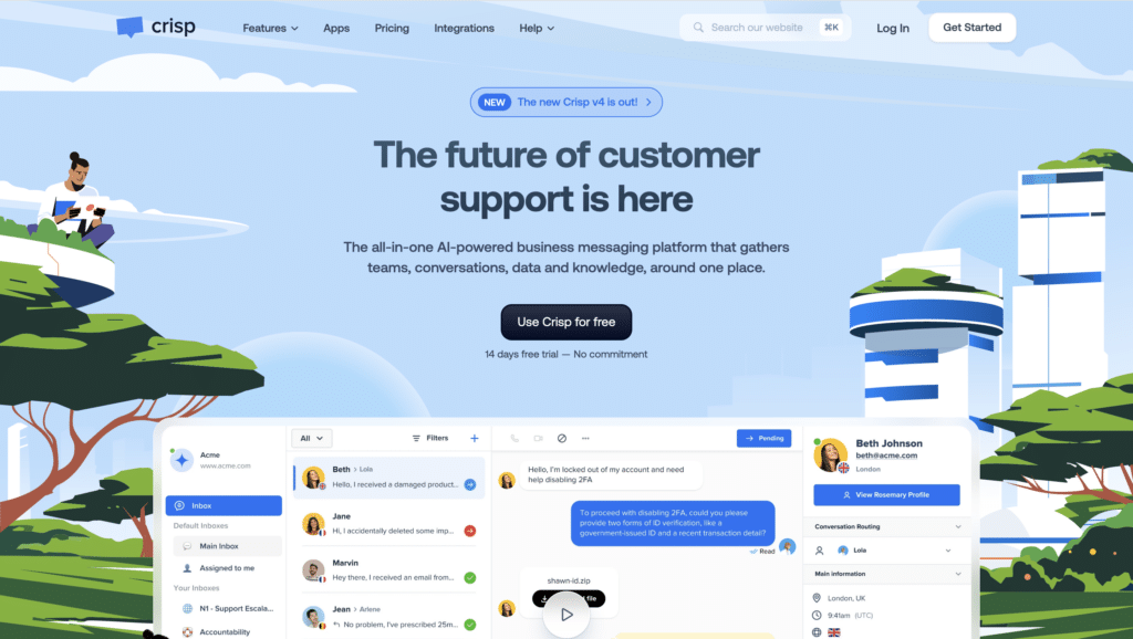
Crisp is a customer messaging platform offering live chat, chatbots, and multichannel support.
What are their standout website features?
They highlight real-time chat capabilities front and centre, with a clean interface. All messages from email, chat, and social appear in a single inbox. Transparent pricing and a free plan encourage sign-ups.
Takeaways to upgrade your website with:
- Spotlight real-time chat on the homepage
- Combine all channels into one unified inbox
- Offer clear, transparent pricing
- Keep the interface simple for quick adoption
27. Lemlist (New entrant)
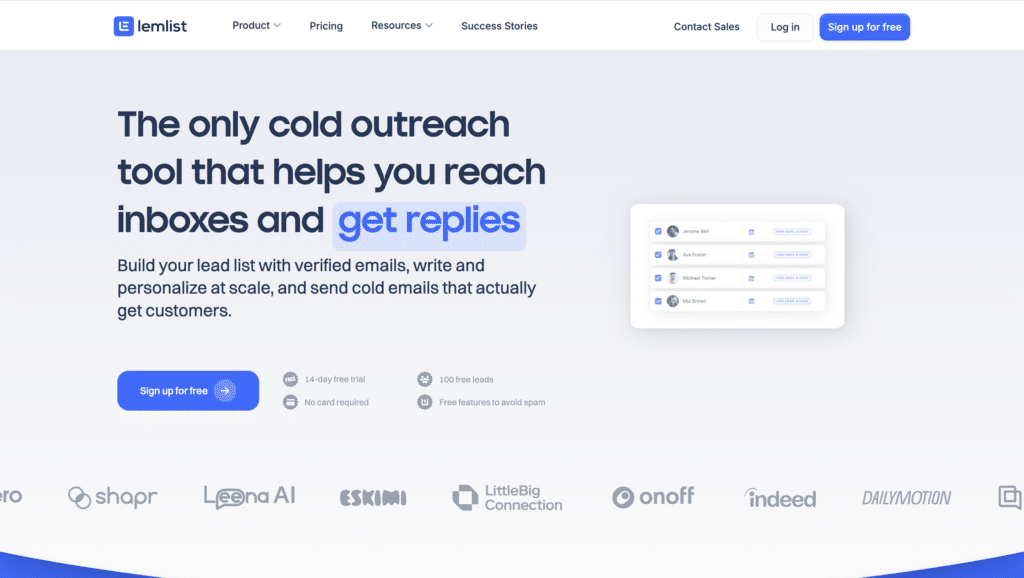
Lemlist is a cold email and sales engagement platform focused on personalised outreach.
What are their standout website features?
They emphasise how customised images and text can boost reply rates. Success stories with real stats back this claim. Short videos guide users on launching campaigns in minutes.
Takeaways to upgrade your website with:
- Make personalisation a central selling point
- Show tangible data or real-world success
- Offer quick how-to videos for setup
- Emphasise time savings through automation
28. Moosend (New entrant)
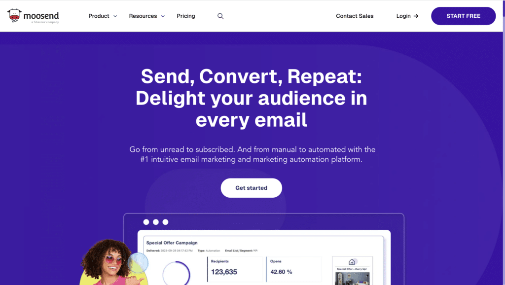
Moosend is an email marketing and automation solution prioritising simplicity.
What are their standout website features?
They keep design clean, with drag-and-drop email editors and ready-to-go automations. A transparent pricing model (including a free plan) helps smaller businesses get started quickly.
Takeaways to upgrade your website with:
- Use minimal design to emphasise ease of use
- Highlight drag-and-drop tools for non-technical audiences
- Keep pricing clear and straightforward
- Offer simple workflows to reduce setup time
29. Clearbit (New entrant)
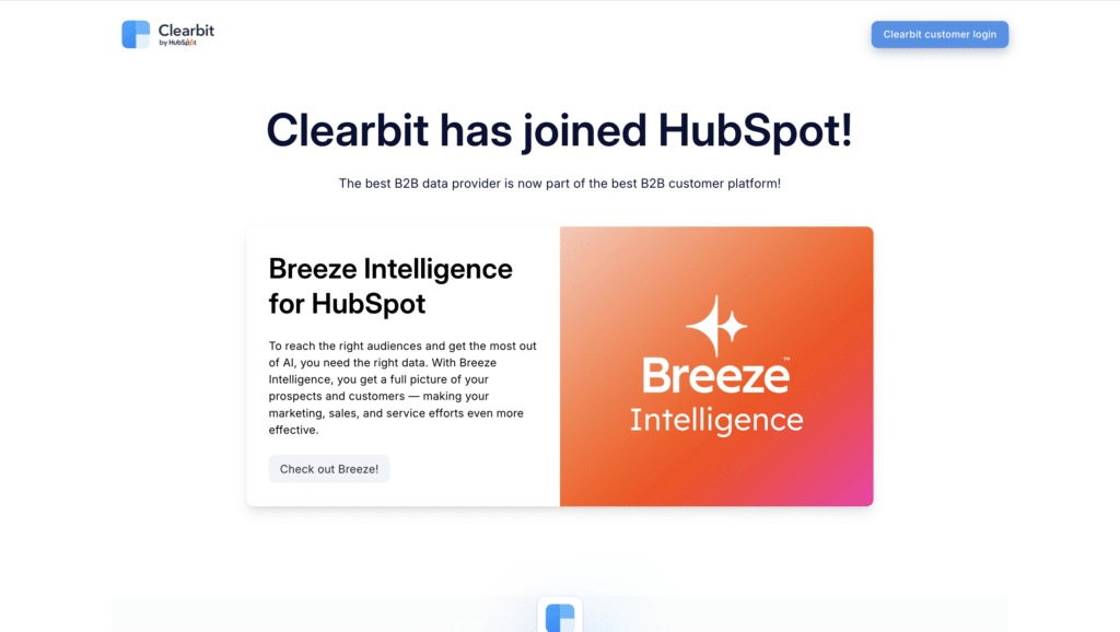
Clearbit is a data enrichment platform that helps businesses identify and target prospects effectively.
What are their standout website features?
They use diagrams to show how Clearbit integrates with CRMs and forms, providing real-time enrichment. The homepage invites visitors to request a demo, emphasising how quick it is to get started.
Takeaways to upgrade your website with:
- Use graphics to clarify data flows
- Explain how integrations boost existing workflows
- Encourage demo requests for hands-on experience
- Highlight real-time benefits for immediate value
30. Datadog (Down from #8)
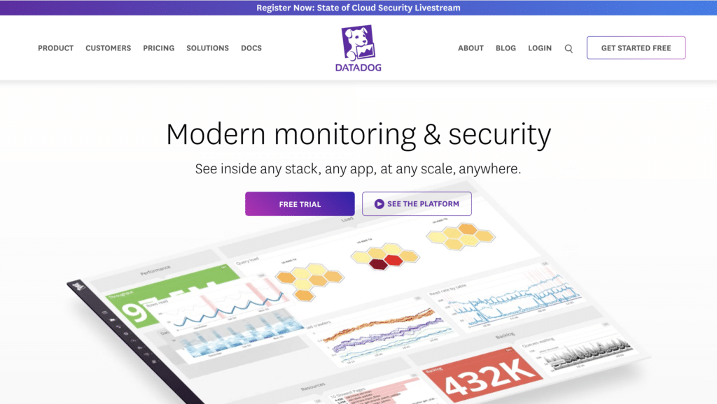
Datadog is a monitoring and analytics platform for developers, IT, and security teams.
What are their standout website features?
They balance technical depth with user-friendly dashboards. Visitors can see previews of metrics, and case studies highlight uptime and speed improvements—key concerns for IT pros.
Takeaways to upgrade your website with:
- Show interactive elements to spark interest
- Explain technical jargon simply where possible
- Use metrics in case studies to prove value
- Include direct links to deeper documentation
31. Zoho CRM (New entrant)
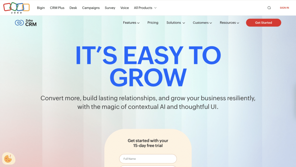
Zoho CRM is a customer relationship management platform suited for small to large businesses.
What are their standout website features?
They offer a simplified layout that highlights sales automation and analytics. A freemium model lets users test core CRM features before committing.
Takeaways to upgrade your website with:
- Provide a freemium or trial plan to reduce risk
- Use simple layouts that highlight top features
- Emphasise analytics and reporting capabilities
- Include clear product demos for quick insight
32. Oracle NetSuite (New entrant)
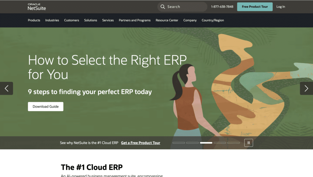
Oracle NetSuite is a cloud ERP system designed for financials, CRM, and e-commerce solutions.
What are their standout website features?
They focus on comprehensive business management, emphasising automation of finance and operations. Video testimonials from established brands highlight NetSuite’s scalability.
Takeaways to upgrade your website with:
- Showcase end-to-end solutions for complex business needs
- Use video testimonials to build trust
- Emphasise scalability for growing businesses
- Highlight automation as a key benefit
33. QuickBooks Online (New entrant)
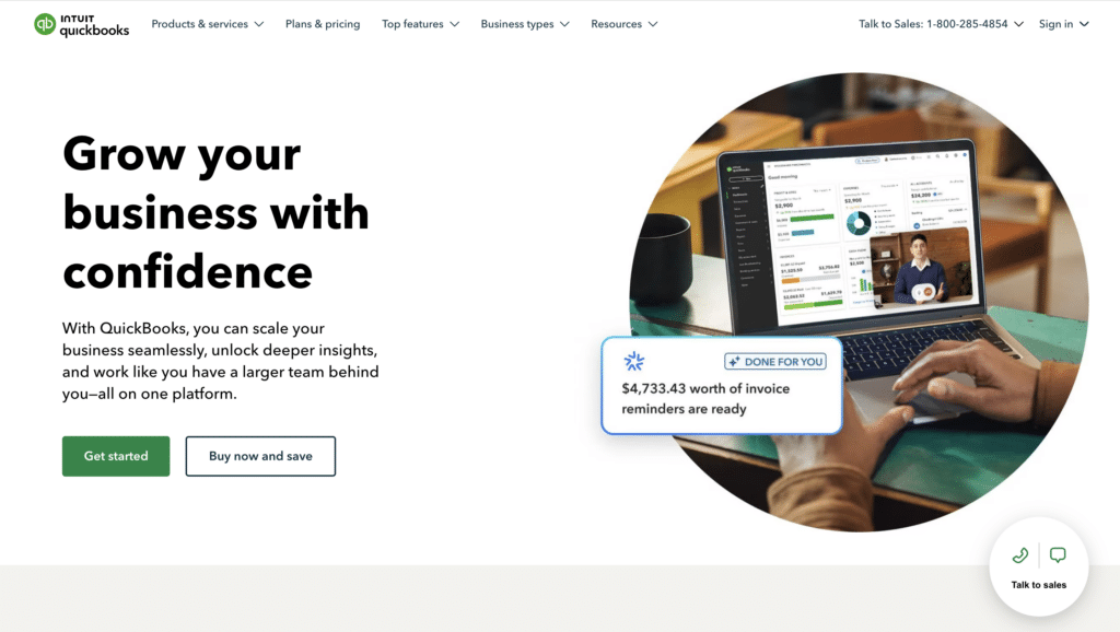
QuickBooks Online is an accounting software solution aimed at freelancers, SMEs, and accountants.
What are their standout website features?
They provide a step-by-step onboarding process for setting up business finances. Pricing tiers are explained clearly, and user testimonials emphasise time saved on bookkeeping.
Takeaways to upgrade your website with:
- Break onboarding into clear, manageable steps
- Offer transparent pricing tiers
- Highlight time saved on routine tasks
- Include success stories from users in similar roles
34. FreshBooks (New entrant)

FreshBooks is a cloud-based accounting software for freelancers and small businesses.
What are their standout website features?
They use plain language and friendly illustrations to explain invoicing, expense tracking, and financial reporting. A free trial CTA is visible, and case studies focus on freelancer success.
Takeaways to upgrade your website with:
- Use clear, simple language for complex financial topics
- Offer a highly visible free trial CTA
- Focus case studies on relatable user types
- Incorporate friendly visuals to ease intimidation
35. Shopify (New entrant)
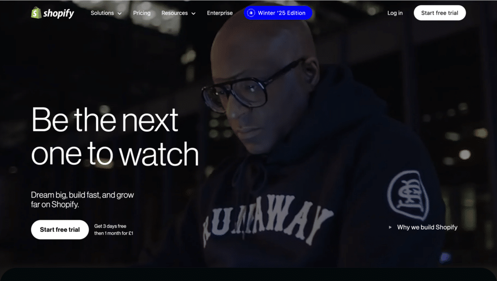
Shopify is an e-commerce platform providing online store creation and payment processing.
What are their standout website features?
They highlight quick store setup and robust payment options. Users can choose from multiple templates, and success stories feature both small shops and larger brands.
Takeaways to upgrade your website with:
- Emphasise easy setup with templates
- Provide flexible payment solutions for broad appeal
- Offer success stories spanning various business sizes
- Keep branding consistent to instil trust
36. BigCommerce (New entrant)
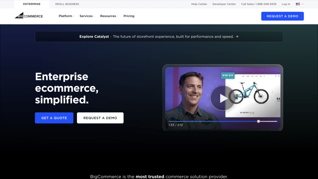
BigCommerce is an e-commerce SaaS platform focusing on scalability and customisation.
What are their standout website features?
They demonstrate how large product catalogs and global shipping can be managed in one interface. Built-in SEO and marketing tools are clearly listed, helping store owners optimise visibility.
Takeaways to upgrade your website with:
- Show how your platform scales for big inventories
- Highlight built-in marketing features
- Offer global shipping and localisation options
- Keep feature lists clear and structured
37. PandaDoc (New entrant)
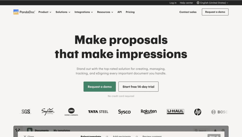
PandaDoc streamlines document creation, e-signatures, and contract management.
What are their standout website features?
They use bright, playful design and emphasise how quickly a document can be set up and signed. Template galleries cater to proposals, quotes, and contracts. Testimonials mention time saved.
Takeaways to upgrade your website with:
- Offer a diverse template library to cover key use cases
- Use a cheerful design to make documents less daunting
- Highlight e-sign capabilities for quick closure
- Emphasise real-world time savings in testimonials
38. DocSend (New entrant)
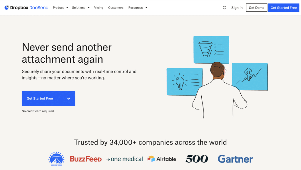
DocSend provides secure document sharing and real-time analytics for sales and fundraising.
What are their standout website features?
They focus on viewer insights, letting users see who opens documents and for how long. Security features like watermarking and link expiry are prominent, building trust with B2B audiences.
Takeaways to upgrade your website with:
- Highlight analytics that show user engagement
- Emphasise security features (watermarking, password protection)
- Allow easy link management and expiry
- Use trust signals for compliance and data protection
39. Recurly (New entrant)

Recurly manages subscription billing and revenue optimisation for SaaS businesses.
What are their standout website features?
They highlight frictionless billing across multiple payment gateways, plus dunning management to reduce churn. Clear metrics on revenue recovery reinforce their ROI promise.
Takeaways to upgrade your website with:
- Focus on billing simplification and easy integrations
- Show data on how churn is reduced or revenue is recovered
- Provide flexible payment options for global reach
- Back up claims with tangible figures
40. ChartMogul (New entrant)
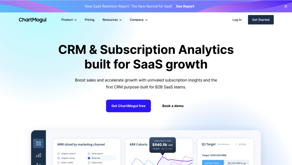
ChartMogul offers subscription analytics and revenue metrics for SaaS companies.
What are their standout website features?
They present a simple dashboard demo focusing on MRR, churn rates, and cohort analysis. Integration with multiple billing platforms is highlighted, helping unify data from different sources.
Takeaways to upgrade your website with:
- Use straightforward dashboards to display core metrics
- Offer integrations for multiple payment providers
- Emphasise churn and retention analysis
- Keep the interface clean and data-focused
41. ChurnZero (New entrant)
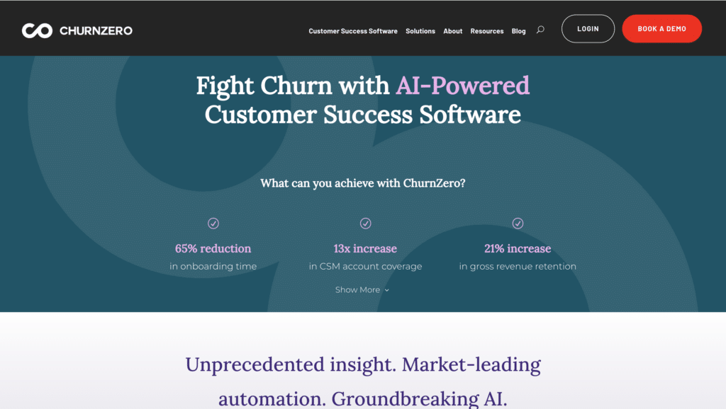
ChurnZero is a customer success platform that helps SaaS companies reduce churn and increase retention.
What are their standout website features?
They spotlight automated playbooks and in-app messaging to keep users engaged. Real-time health scores highlight customer status, enabling proactive outreach.
Takeaways to upgrade your website with:
- Offer proactive features that prevent churn
- Use real-time dashboards to measure customer health
- Explain the value of automated playbooks
- Include short case studies showing improved retention
42. Surfer (New entrant)
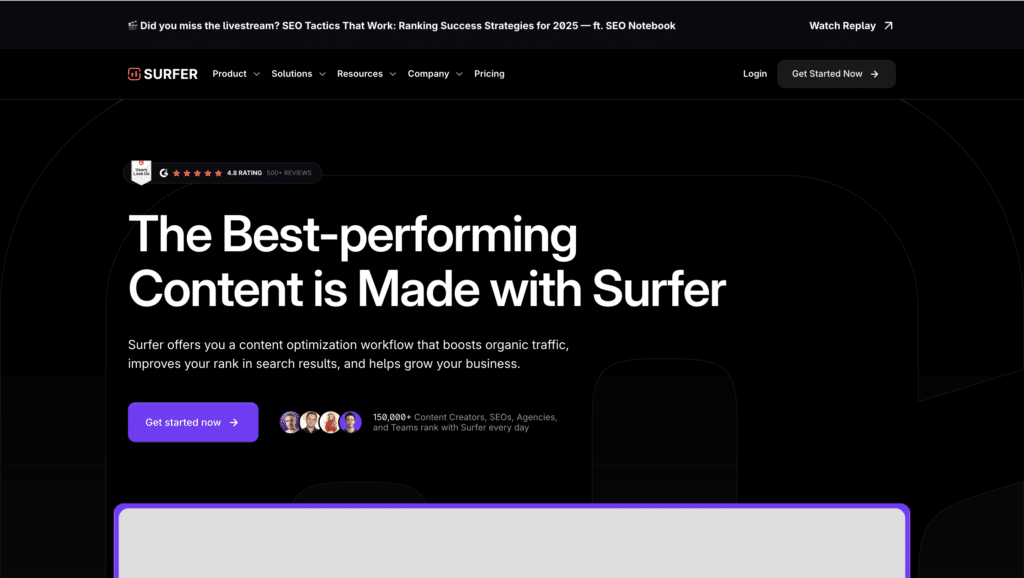
Surfer is an SEO tool that helps optimise on-page content for higher search rankings.
What are their standout website features?
They present a live text editor that scores content based on keywords and structure. Clear data visuals show how tweaks can raise a page’s likelihood of ranking well.
Takeaways to upgrade your website with:
- Use an interactive editor for instant feedback
- Provide visual data on suggested SEO improvements
- Keep the UI straightforward for content writers
- Offer real-time scoring to show progress
43. Semrush (New entrant)
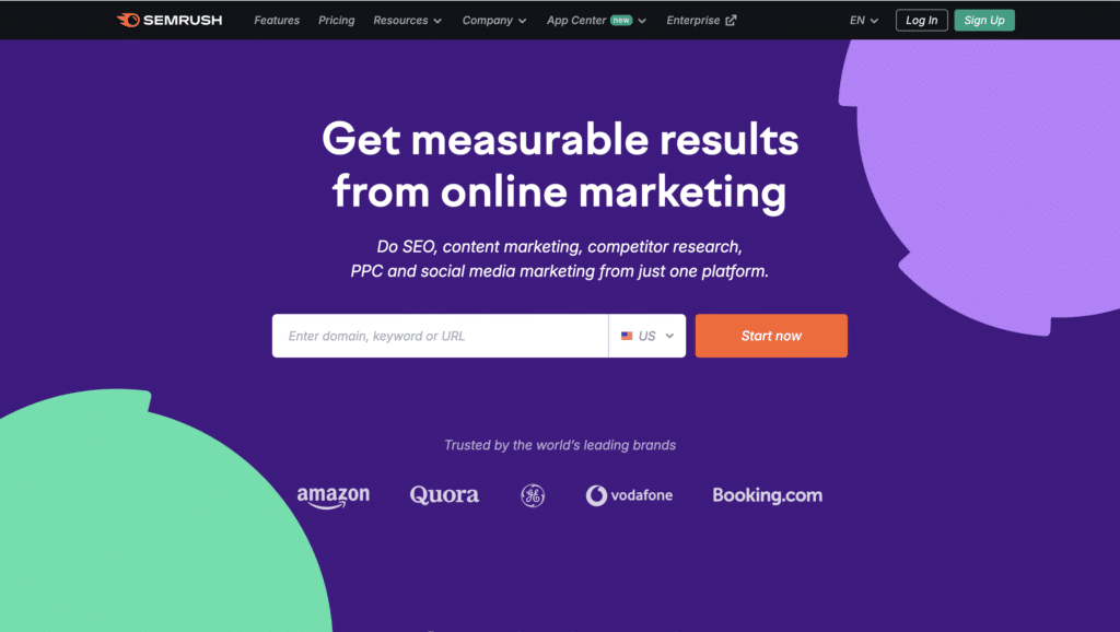
Semrush is a digital marketing toolkit covering SEO, PPC, and competitive research.
What are their standout website features?
They offer an all-in-one dashboard to track keyword rankings, site audits, and competitor ads. Free trials highlight immediate insights, while a blog educates users on marketing best practices.
Takeaways to upgrade your website with:
- Provide comprehensive dashboards for multiple channels
- Offer a free trial to encourage exploration
- Combine product features with educational resources
- Emphasise competitor insights for strategic advantage
44. Ahrefs (New entrant)
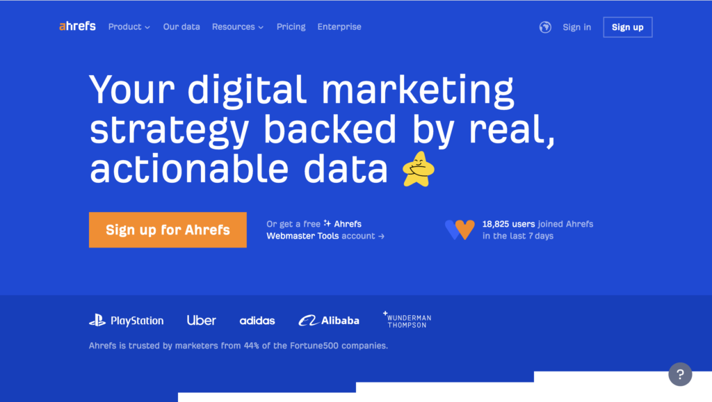
Ahrefs is an SEO platform focusing on backlinks, keyword research, and competitor analysis.
What are their standout website features?
They highlight site explorer tools that show backlink profiles, plus rank tracking to measure progress. A well-stocked academy teaches new SEO tactics, building brand trust.
Takeaways to upgrade your website with:
- Show detailed analytics for backlinks and keywords
- Provide an educational hub for ongoing user skill growth
- Emphasise competitor comparison features
- Use rank tracking to demonstrate performance over time
45. Sprout Social (New entrant)
Sprout Social helps businesses manage and analyse social media interactions.
What are their standout website features?
They unify multiple social channels into a single dashboard. Their analytics tools reveal engagement trends and audience demographics. Case studies show social ROI improvements.
Takeaways to upgrade your website with:
- Offer a unified dashboard for multiple social platforms
- Include robust analytics to measure engagement
- Show ROI improvements with real customer examples
- Make the interface intuitive for quick adoption
46. Buffer (New entrant)
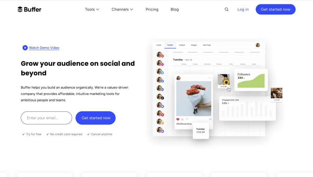
Buffer is a social media scheduling tool that simplifies content planning.
What are their standout website features?
They focus on a simple queue interface where users can line up posts across different networks. A free basic plan lowers the risk for new users. Clean analytics show which posts perform best.
Takeaways to upgrade your website with:
- Keep scheduling interfaces intuitive
- Offer a free tier to attract new or casual users
- Use analytics to highlight top-performing content
- Make multi-platform posting seamless
47. Brandwatch (New entrant)
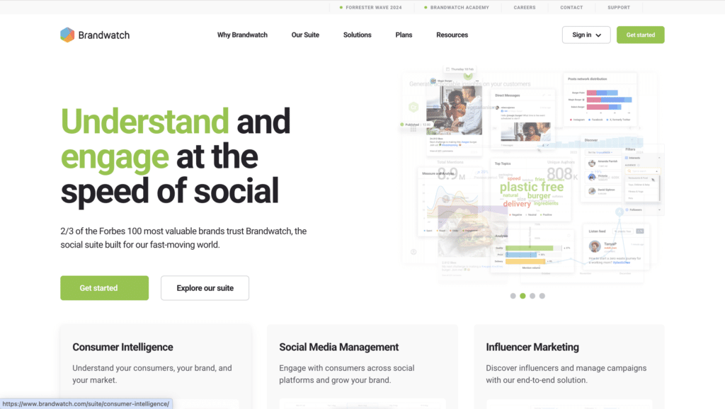
Brandwatch is a social listening and consumer intelligence platform.
What are their standout website features?
They visualise data from social media, news sites, and forums to show brand sentiment. Interactive charts highlight trending topics, and curated case studies demonstrate real-world impact.
Takeaways to upgrade your website with:
- Use engaging data visuals for brand sentiment
- Include examples of actionable insights
- Highlight cross-channel coverage (social, news, forums)
- Show short case studies focusing on outcomes
48. Interact (New entrant)
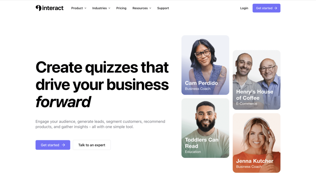
Interact lets marketers create quizzes and interactive content to generate leads.
What are their standout website features?
They have a large template library for personality quizzes, assessments, and giveaways. The website focuses on lead capture, with integrations to email marketing tools for automated follow-up.
Takeaways to upgrade your website with:
- Provide a diverse set of ready-to-use templates
- Emphasise lead capture benefits
- Integrate with popular marketing platforms
- Include fun elements to encourage user interaction
49. Hotjar (New entrant)

Hotjar analyses user behaviour with heatmaps, session recordings, and feedback polls.
What are their standout website features?
They present dynamic visuals showing how users scroll and click on a site. Straightforward tutorials guide new clients, and the free plan encourages trial.
Takeaways to upgrade your website with:
- Use visual data (heatmaps) to illustrate user behaviour
- Offer session recordings for deeper insights
- Include a free plan or trial to reduce adoption friction
- Keep tutorials or onboarding simple
50. FullStory (New entrant)
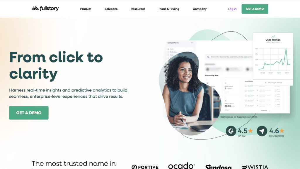
FullStory captures user sessions and interactions for product and UX improvements.
What are their standout website features?
They highlight session replays that let teams see exactly how users navigate. Easy segmentation shows where conversions drop off, helping pinpoint design or usability issues.
Takeaways to upgrade your website with:
- Offer session replays to identify friction points
- Use segmentation to find problem areas quickly
- Emphasise how analytics drive UX improvements
- Keep the interface inviting for both dev and non-dev teams
51. Toggl Track (New entrant)
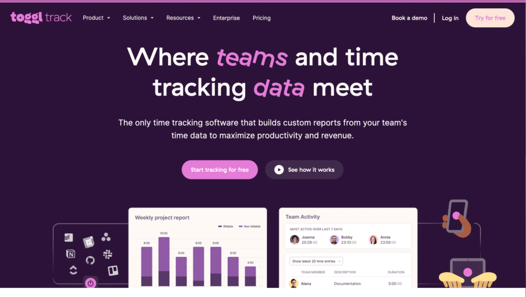
Toggl Track is a time-tracking and reporting tool for freelancers and teams.
What are their standout website features?
They highlight a one-click timer with cross-platform compatibility. User-friendly reports show billable hours, project progress, and profitability in real time.
Takeaways to upgrade your website with:
- Use minimal design for quick start and minimal friction
- Show real-time data on project hours and costs
- Offer cross-device syncing for on-the-go tracking
- Include free tiers or trials for entry-level users
52. Harvest (New entrant)
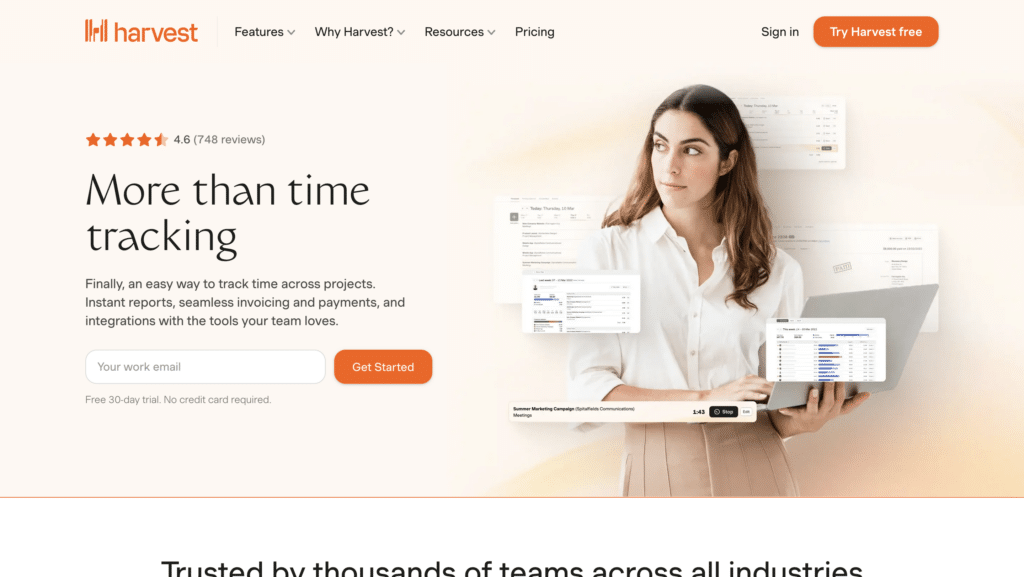
Harvest is a time-tracking and invoicing platform that integrates with multiple project management tools.
What are their standout website features?
They focus on intuitive time-tracking paired with direct invoicing. Simple charts and timesheets show how employees spend work hours, providing insights for better resource allocation.
Takeaways to upgrade your website with:
- Combine time-tracking and invoicing to shorten workflows
- Provide clear visuals of how time is allocated
- Integrate with popular project management solutions
- Keep onboarding steps straightforward
53. ClickUp (New entrant)
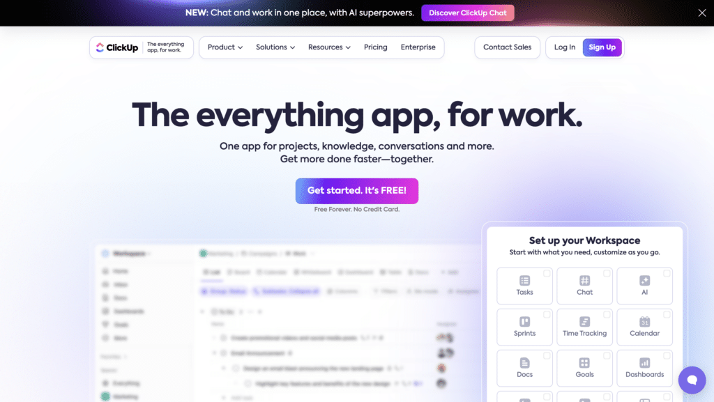
ClickUp is a project management suite offering task management, docs, and goal tracking.
What are their standout website features?
They advertise “one app to replace them all” by consolidating tasks, documents, and team chat in a single tool. Templates for sprints, Kanban boards, and other workflows support quick adoption.
Takeaways to upgrade your website with:
- Emphasise a unifying approach to replace multiple apps
- Offer pre-built workflow templates for fast starts
- Highlight integration with popular tools or calendars
- Keep the interface modular for customisation
54. PayPal for Business (New entrant)
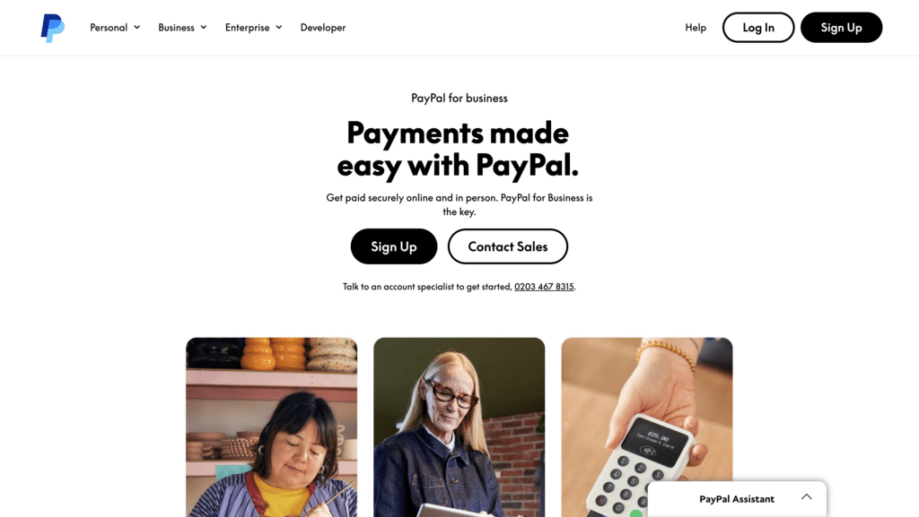
PayPal for Business provides payment solutions and invoicing for SMEs and larger enterprises.
What are their standout website features?
They focus on global payment reach with strong buyer protection. Simple tutorials explain how to set up payment buttons and integrate PayPal into e-commerce checkouts.
Takeaways to upgrade your website with:
- Offer clear guides for integration or setup
- Emphasise global coverage and buyer protection
- Keep the interface consistent and easy to navigate
- Use trust seals or certifications for credibility
55. Mailchimp (New entrant)
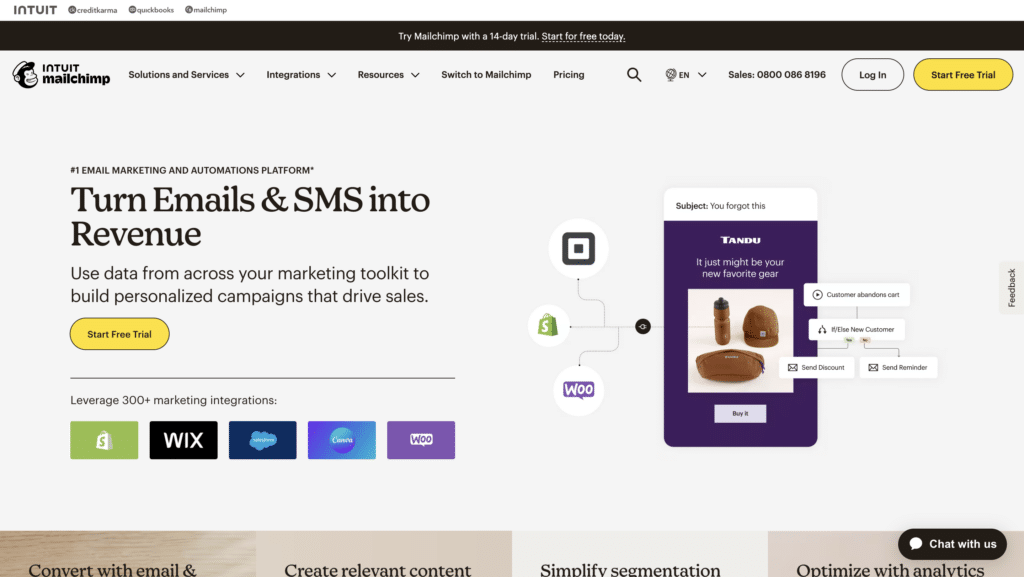
Mailchimp is an email marketing platform that also provides landing pages and automation.
What are their standout website features?
They offer a free tier ideal for smaller newsletters. Their brand is fun and approachable, with monkey-themed visuals. Automated workflows, audience segmentation, and basic CRM features keep everything centralised.
Takeaways to upgrade your website with:
- Use approachable branding for immediate familiarity
- Offer free plans to attract small or new businesses
- Centralise features (email, landing pages, automation)
- Highlight easy audience segmentation
56. ConvertKit (New entrant)
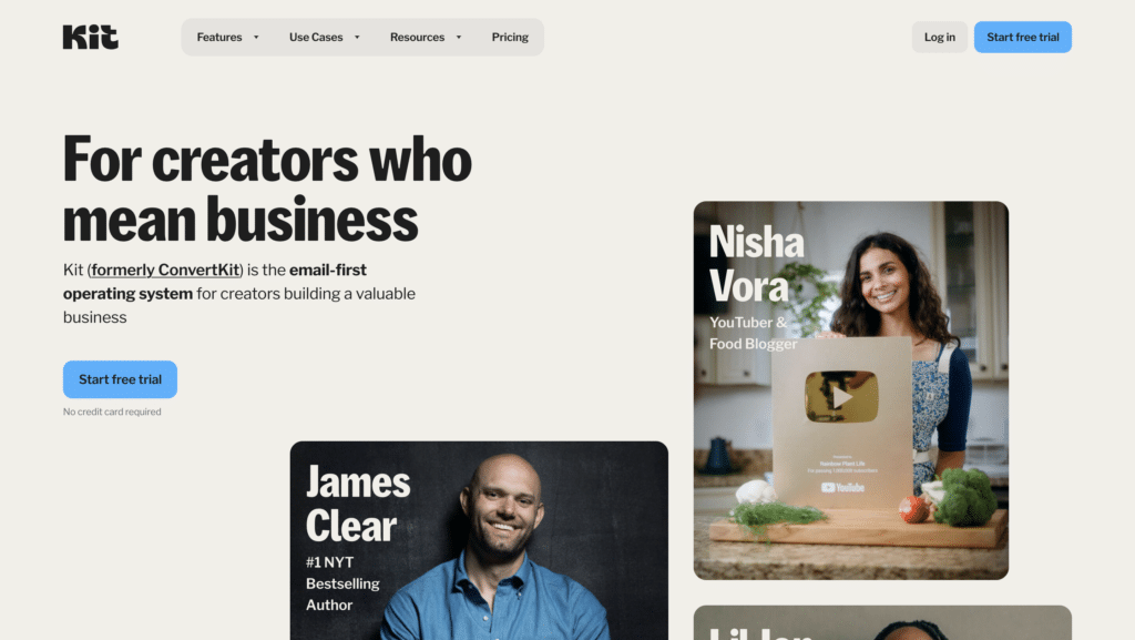
ConvertKit is an email marketing platform focused on creators and bloggers.
What are their standout website features?
They highlight visual automation funnels, showing how subscribers move between sequences. The design is clean and minimal, appealing to creative professionals who want a no-clutter approach.
Takeaways to upgrade your website with:
- Use a clean design for minimal distractions
- Provide visual automation flows for clarity
- Speak directly to a niche audience (creators)
- Offer simple sign-up forms and customisable templates
57. Kajabi (New entrant)
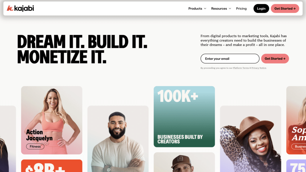
Kajabi is a platform for creating and selling online courses, memberships, and digital products.
What are their standout website features?
They feature step-by-step guides on building a course, from content upload to payment setup. Testimonials from course creators highlight revenue earned and time saved.
Takeaways to upgrade your website with:
- Focus on end-to-end creation for digital products
- Use success stories to inspire new creators
- Offer simple payment and checkout options
- Highlight easy content organisation
58. Teachable (New entrant)
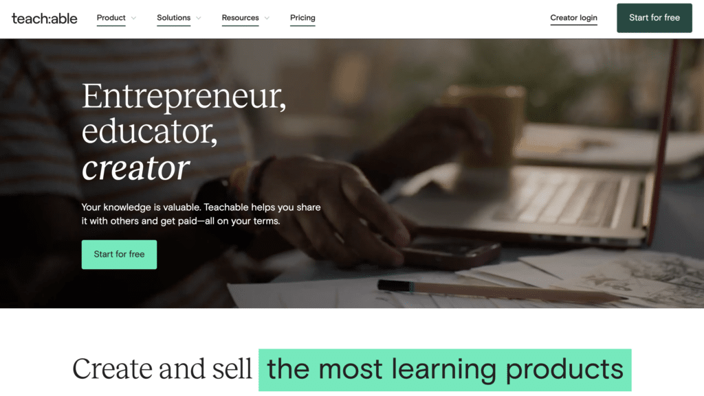
Teachable helps individuals and businesses build and sell online courses.
What are their standout website features?
Their homepage emphasises the simplicity of creating lessons, hosting videos, and enrolling students. Pricing tiers scale based on transaction fees, making it flexible for different volumes.
Takeaways to upgrade your website with:
- Keep the course-building process straightforward
- Offer flexible pricing that grows with your user
- Emphasise how easy it is to upload and host videos
- Use testimonials showing real instructor earnings
59. Thinkific (New entrant)
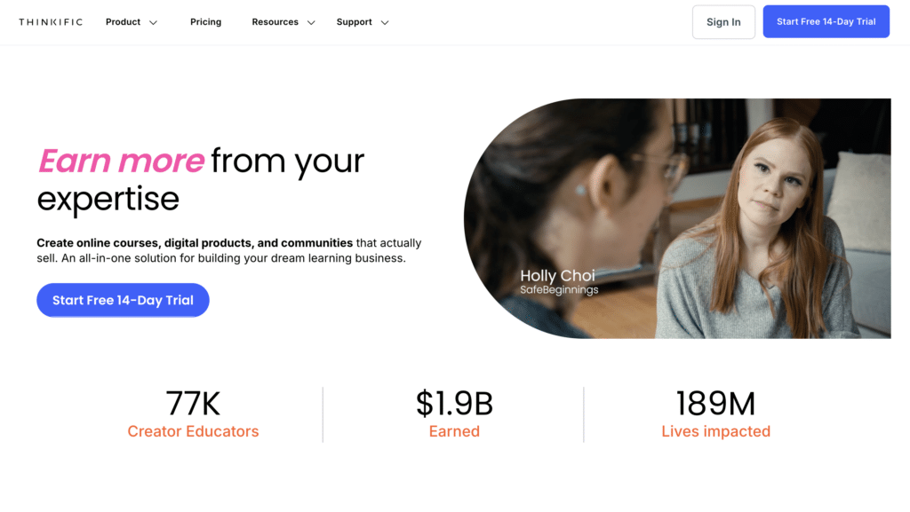
Thinkific is an online course platform aimed at coaches, consultants, and entrepreneurs.
What are their standout website features?
They highlight custom branding so creators can own their course’s look and feel. A library of templates supports quick setup, and built-in marketing tools encourage student growth.
Takeaways to upgrade your website with:
- Let users personalise branding for their courses
- Provide ready-made templates to speed up launch
- Include marketing features to help creators grow
- Emphasise easy navigation for students
60. TalentLMS (New entrant)
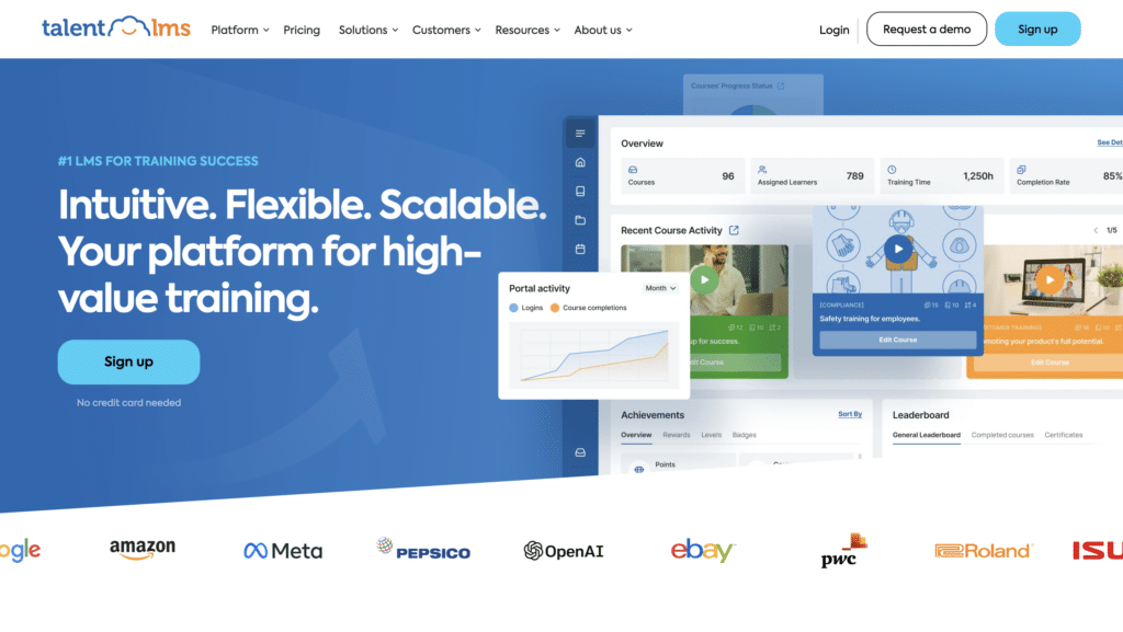
TalentLMS is a learning management system tailored for employee training and onboarding.
What are their standout website features?
They showcase quick course creation, gamification, and user progress tracking. A strong focus on corporate training and compliance helps larger companies easily standardise learning.
Takeaways to upgrade your website with:
- Feature gamification to boost learning engagement
- Offer detailed analytics on user progress
- Enable easy compliance course creation
- Keep the interface intuitive for both admins and learners
61. 15Five (New entrant)
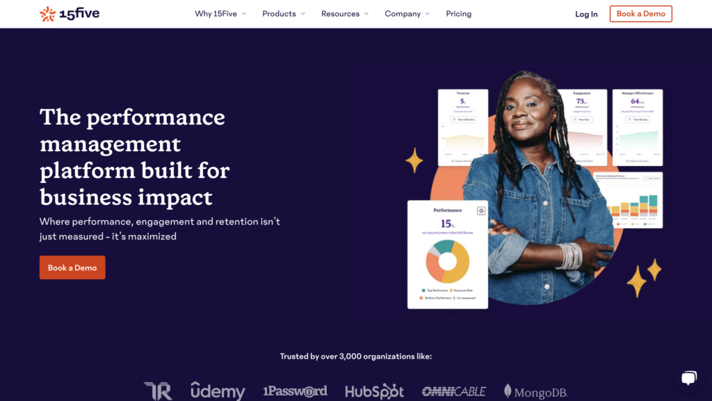
15Five is a performance management tool that fosters employee engagement and feedback.
What are their standout website features?
They use weekly check-ins, goal-setting, and peer recognition to encourage open communication. The site is bright, emphasising simplicity in performance reviews and continuous feedback loops.
Takeaways to upgrade your website with:
- Encourage a culture of frequent feedback
- Use a clean design for performance insights
- Offer peer recognition features to boost morale
- Highlight how regular check-ins improve engagement
62. Lattice (New entrant)
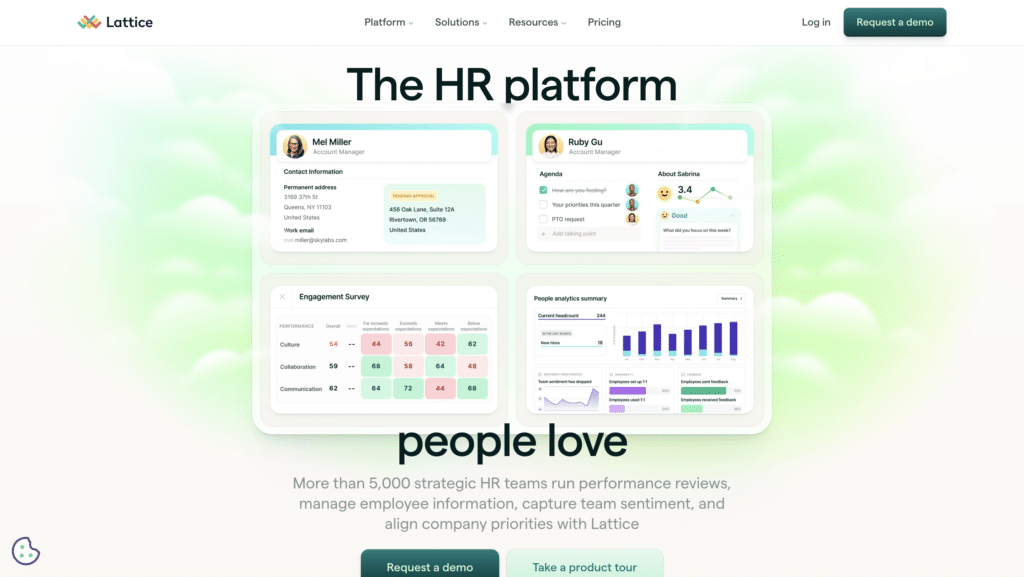
Lattice is a people management platform focusing on OKRs, reviews, and employee development.
What are their standout website features?
They position OKR tracking, feedback, and career growth in one system. Case studies from tech scale-ups show how Lattice helps unify performance data and fosters a growth mindset.
Takeaways to upgrade your website with:
- Combine OKRs with performance reviews for consistency
- Highlight career growth as a key benefit
- Show data-based success stories from well-known brands
- Keep dashboards user-friendly for HR teams
63. Gusto (New entrant)
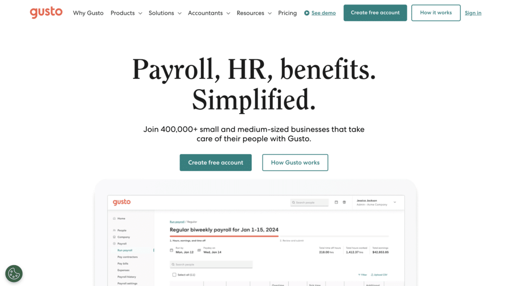
Gusto provides payroll, benefits, and HR tools for small businesses.
What are their standout website features?
They emphasise automated payroll runs, paperless onboarding, and health insurance management. Their design is friendly, focusing on small biz owners who need an all-in-one HR solution.
Takeaways to upgrade your website with:
- Offer an all-in-one approach for payroll and HR
- Use a friendly tone to appeal to non-experts
- Highlight compliance and automation benefits
- Include testimonials from small business owners
64. Paychex (New entrant)
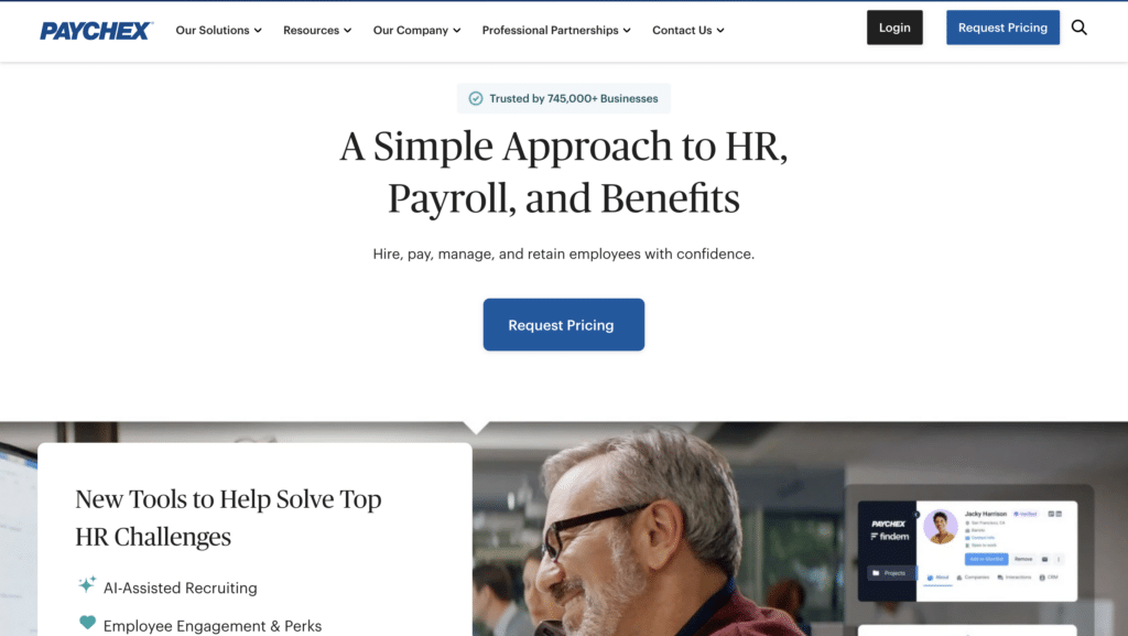
Paychex offers payroll, HR, and benefits solutions tailored to various business sizes.
What are their standout website features?
They spotlight flexible pricing and personal support. Industry-specific pages address unique HR needs, and compliance checklists help users stay up to date with regulations.
Takeaways to upgrade your website with:
- Offer custom solutions for different industries
- Emphasise compliance support in marketing
- Provide a mix of self-service and personal guidance
- Show clear pricing tiers for businesses of various scales
65. BambooHR (New entrant)
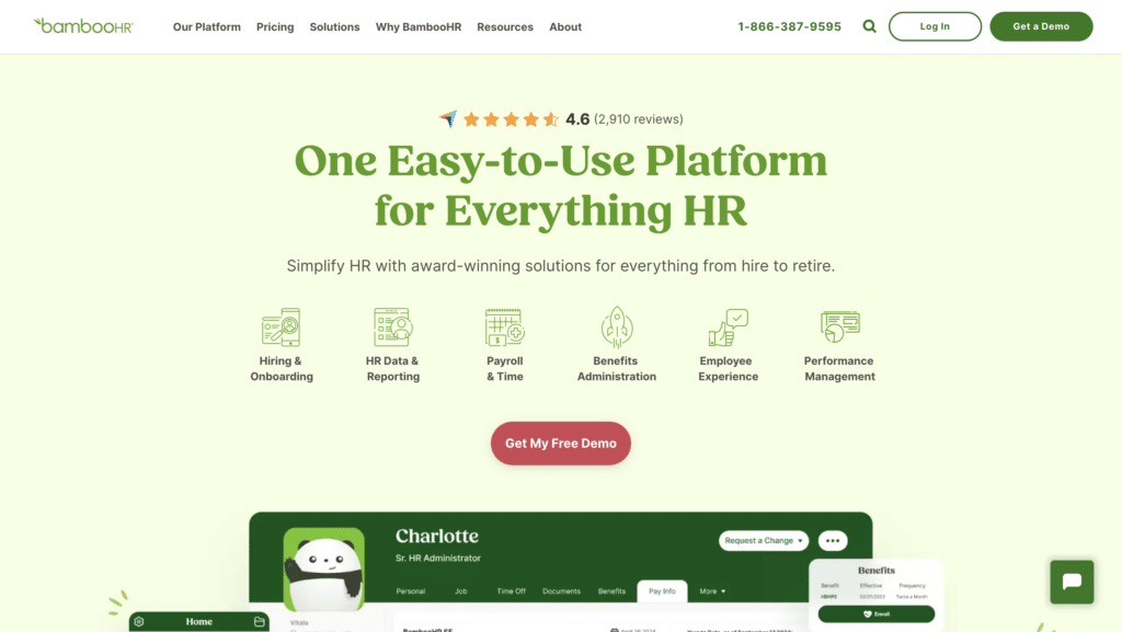
BambooHR is an HR software platform for growing companies, focusing on employee records and performance.
What are their standout website features?
They show a clean dashboard for managing employee data, with quick insights into PTO, onboarding, and performance reviews. A free trial CTA and short videos demonstrate how easy it is to switch from spreadsheets.
Takeaways to upgrade your website with:
- Keep HR data simple and accessible
- Use short videos to explain process steps
- Highlight a smooth transition from manual methods
- Promote a free trial for hands-on experience
66. Deel (New entrant)

Deel simplifies global payroll and compliance for remote teams hiring internationally.
What are their standout website features?
They underscore compliance with local employment laws, handling contracts and taxes across different countries. A cost calculator helps estimate budgets for international hires.
Takeaways to upgrade your website with:
- Focus on global compliance as a unique selling point
- Provide a tool to help users estimate costs
- Offer streamlined contract generation in various countries
- Keep the interface simple despite complex legal tasks
67. Remote (New entrant)
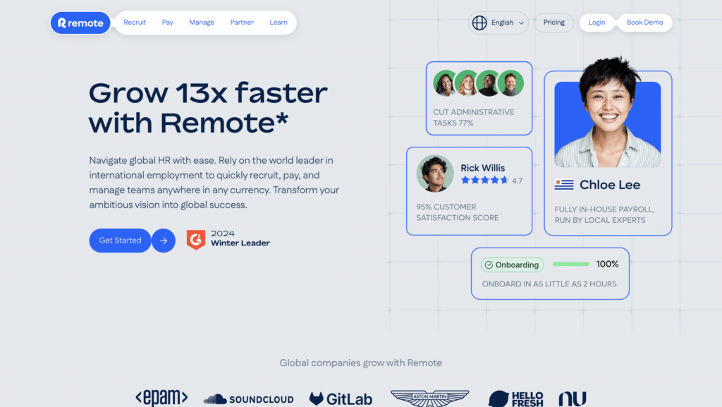
Remote assists companies with hiring and paying international workers, covering payroll, benefits, and compliance.
What are their standout website features?
They emphasise quick onboarding of remote employees in different countries. Their FAQ-driven design addresses the complexities of local regulations, and a clear pricing model helps estimate monthly costs.
Takeaways to upgrade your website with:
- Answer complex questions with a simple FAQ format
- Provide transparent pricing for global hiring
- Focus on ease of onboarding and compliance
- Highlight local tax and legal expertise
68. HackerRank (New entrant)
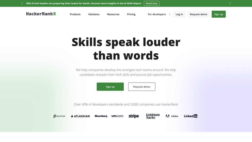
HackerRank is a technical hiring platform for assessing coding skills and hosting challenges.
What are their standout website features?
They feature real coding tests with auto-grading. Built-in interview tools enable live coding sessions, and leaderboards add a fun, competitive element for candidates.
Takeaways to upgrade your website with:
- Use interactive challenges to gauge skill quickly
- Offer real-time feedback during assessments
- Include live coding sessions for deeper insight
- Show how gamification can attract top talent
69. Codility (New entrant)
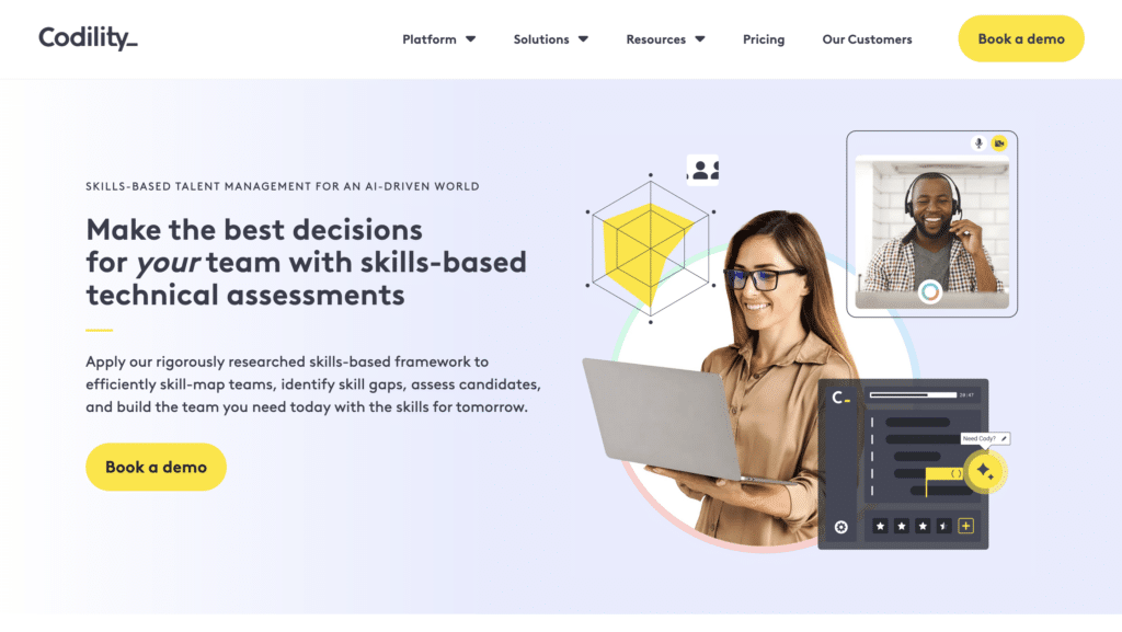
Codility provides coding tests and interview platforms to hire tech talent efficiently.
What are their standout website features?
They emphasise developer-friendly challenge environments, with instant feedback and robust anti-cheating measures. Case studies from leading tech firms add credibility.
Takeaways to upgrade your website with:
- Offer a comfortable coding environment for candidates
- Provide immediate results and feedback to save time
- Assure quality with anti-cheating and fairness measures
- Use well-known brand endorsements for trust
70. TestGorilla (New entrant)
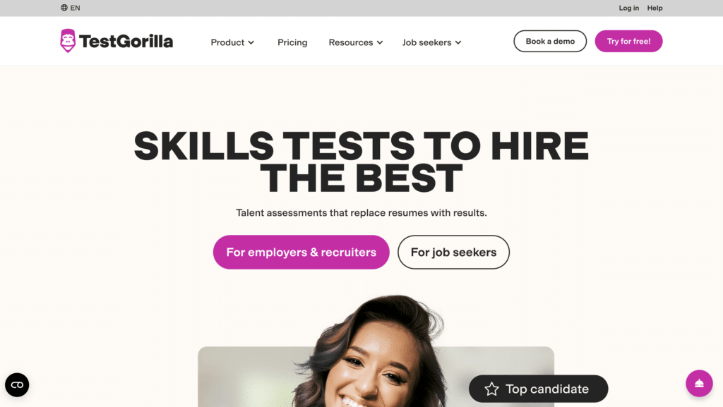
TestGorilla offers skills tests for various roles, from software development to customer support.
What are their standout website features?
They highlight a library of pre-built tests, covering both hard and soft skills. Their site underscores how standardised assessments reduce hiring bias and speed up candidate screening.
Takeaways to upgrade your website with:
- Provide a wide range of skill assessments for varied roles
- Emphasise fairness and reducing hiring bias
- Use pre-built tests for quick implementation
- Promote data-driven candidate evaluation
71. Calendly for Teams (New entrant)
Calendly for Teams expands on Calendly’s scheduling features with team-based coordination.
What are their standout website features?
They focus on pooled availability, allowing multiple people to share open time slots. Round-robin and collective scheduling reduce the complexity of team meetings.
Takeaways to upgrade your website with:
- Offer advanced scheduling for groups and teams
- Highlight round-robin features to distribute meetings
- Use shared availability for multiple team members
- Keep the user flow straightforward even for large teams
72. Acuity Scheduling (New entrant)
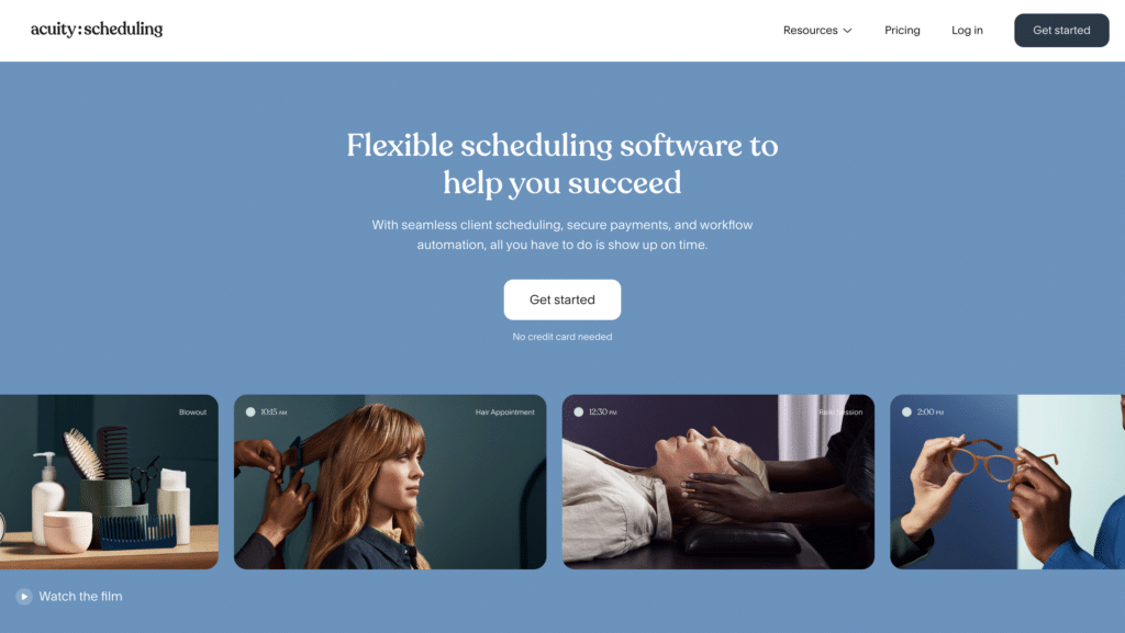
Acuity Scheduling simplifies client bookings and appointment management for service providers.
What are their standout website features?
They offer custom intake forms, payment integrations, and automatic time-zone conversions. A strong emphasis on brand customisation helps small businesses match their booking page to their site’s design.
Takeaways to upgrade your website with:
- Provide branded booking pages that match business identities
- Automate scheduling across different time zones
- Include payment gateways for seamless booking and checkout
- Keep intake forms flexible for varied services
73. Book Like A Boss (New entrant)
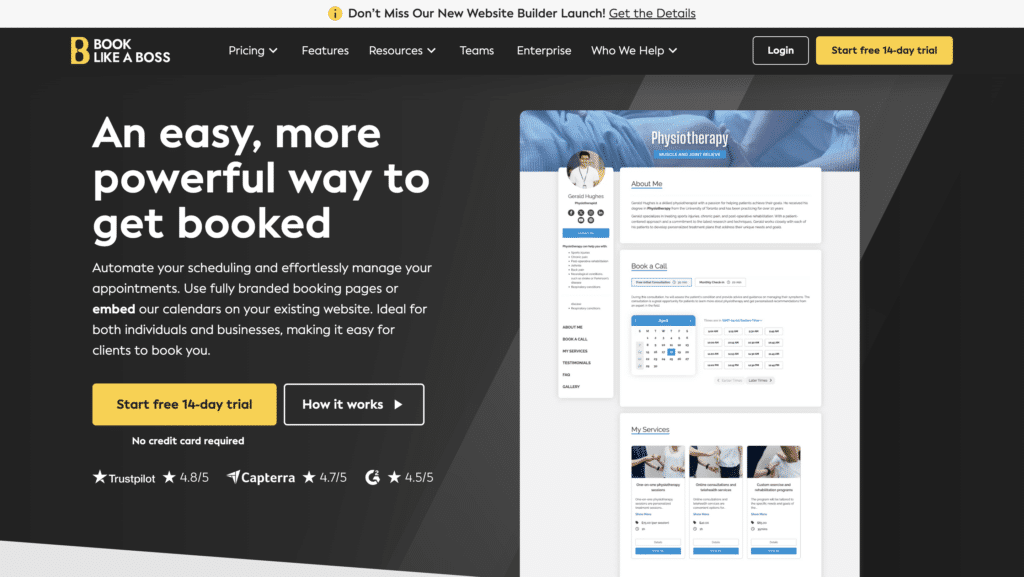
Book Like A Boss is a booking page builder that integrates calendars, payments, and custom branding.
What are their standout website features?
They use a single landing page approach, letting solopreneurs or small teams display services, pricing, and open slots. Easy integrations with Stripe or PayPal streamline payment collection.
Takeaways to upgrade your website with:
- Consolidate services, availability, and payment on one page
- Keep branding consistent for a professional look
- Provide direct integrations with payment processors
- Offer quick customisation options for small businesses
74. Xero (New entrant)
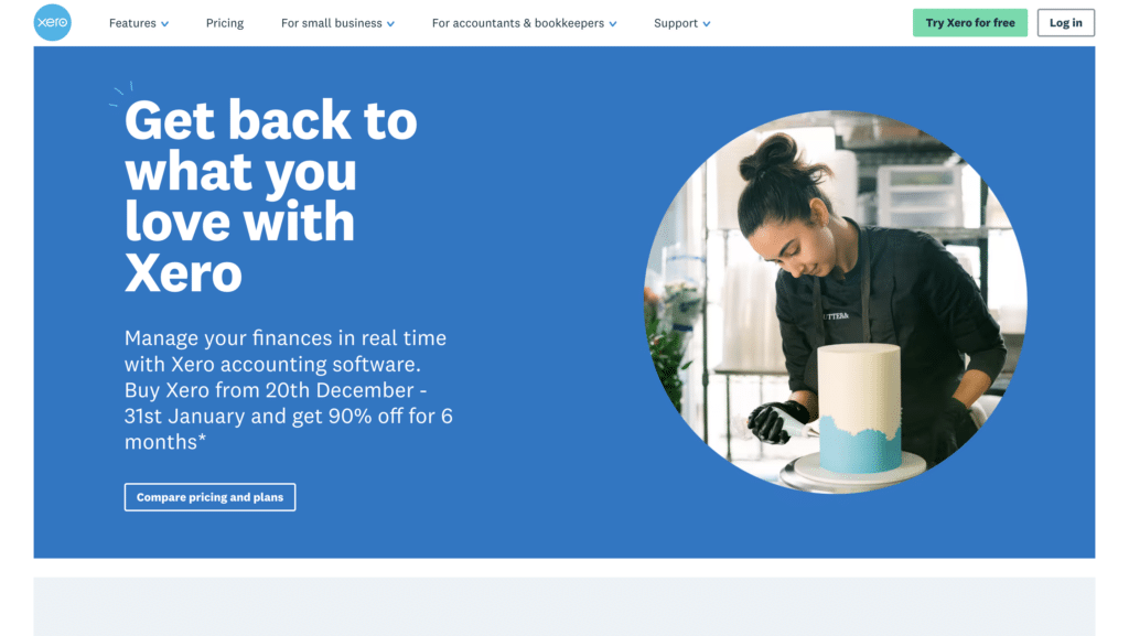
Xero is a cloud-based accounting software for SMEs and accountants.
What are their standout website features?
They focus on live bank feeds for real-time tracking of cash flow, plus multi-currency support. A resource centre includes tips on taxes, payroll, and general small business management.
Takeaways to upgrade your website with:
- Emphasise real-time financial visibility
- Provide multi-currency functionality for global commerce
- Host helpful guides on accounting and compliance
- Keep design inviting for non-accountants
75. Bench (New entrant)
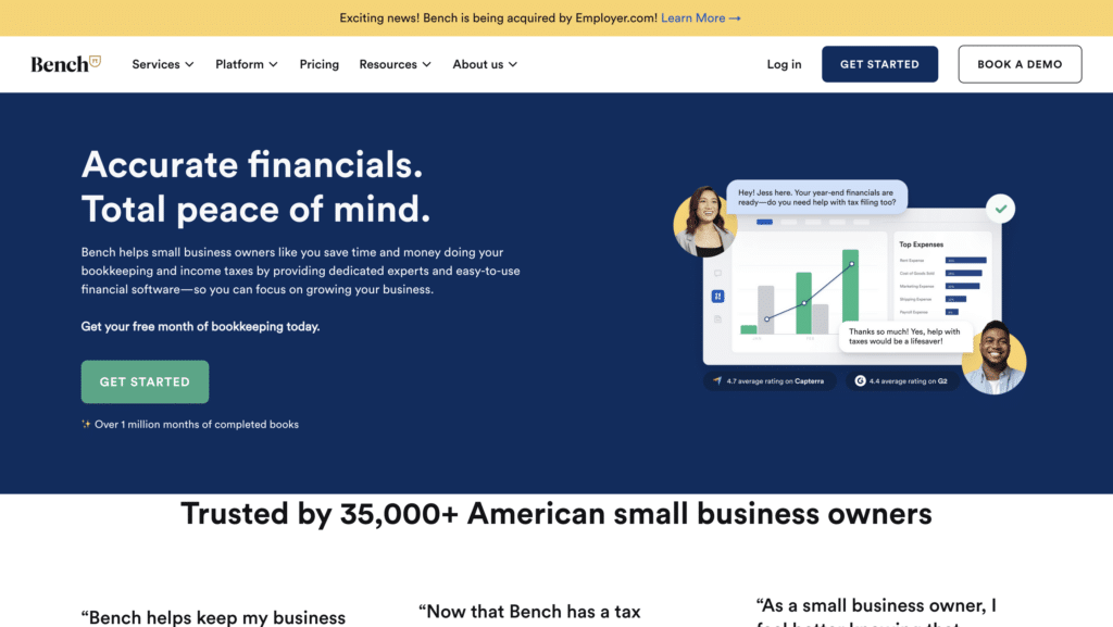
Bench combines bookkeeping software with human bookkeepers for US-based small businesses.
What are their standout website features?
They highlight a “done-for-you” approach: you link bank accounts, and Bench’s team handles monthly reconciliation. Their site uses friendly design and plain language to reduce financial anxiety.
Takeaways to upgrade your website with:
- Promote a hybrid approach of software + human experts
- Use plain language to demystify finances
- Keep data importing straightforward
- Highlight results: accurate books, less stress
76. Wave (New entrant)
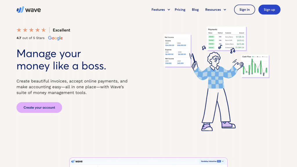
Wave provides free accounting and invoicing software, plus paid payroll services.
What are their standout website features?
They emphasise a zero-cost core product, suitable for freelancers and small businesses. An integrated dashboard shows invoices, transactions, and profit/loss at a glance.
Takeaways to upgrade your website with:
- Attract budget-conscious users with a free core offer
- Keep the interface simple for non-accountants
- Promote optional paid add-ons like payroll
- Use a central dashboard to unify key financial data
77. ShipStation (New entrant)
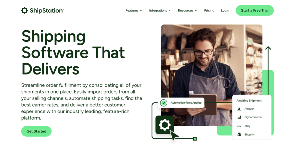
ShipStation is a shipping and order management platform for e-commerce businesses.
What are their standout website features?
They integrate with major e-commerce platforms, simplifying label printing and shipping rate comparisons. Their site highlights discounted shipping rates and time saved on order fulfilment.
Takeaways to upgrade your website with:
- Offer integrations with popular store platforms
- Provide easy label printing and shipping automation
- Show potential cost savings via discounted rates
- Emphasise how automation reduces fulfilment time
78. ShipBob (New entrant)
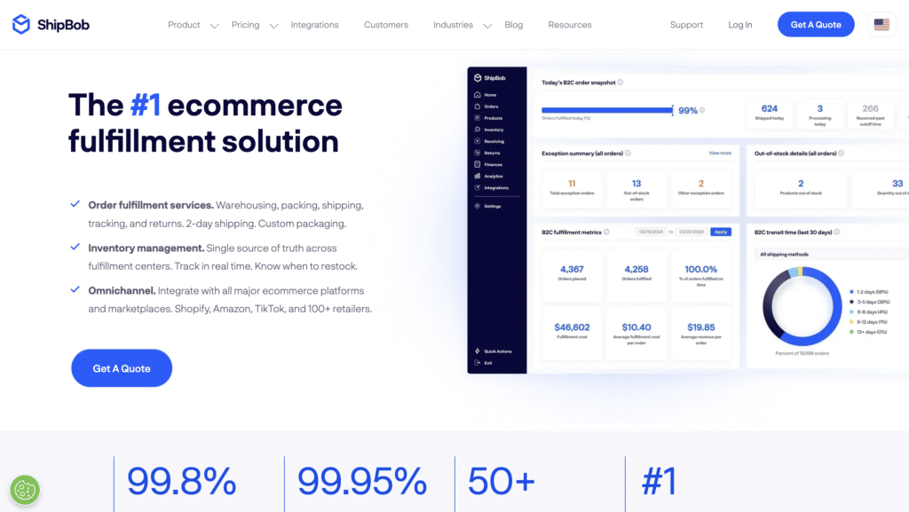
ShipBob handles fulfilment and warehousing, giving e-commerce brands a global logistics network.
What are their standout website features?
They emphasise distributed warehousing for faster shipping, plus real-time inventory tracking across multiple locations. Case studies show reduced shipping times and happier customers.
Takeaways to upgrade your website with:
- Highlight global warehouse coverage and fast delivery
- Provide real-time inventory visibility
- Use customer stories focusing on reduced shipping times
- Explain how multi-location shipping cuts costs and delays
79. Printful (New entrant)
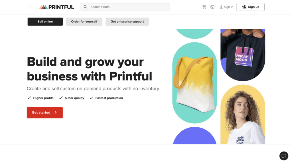
Printful provides on-demand printing and fulfilment for clothing, accessories, and homeware.
What are their standout website features?
They showcase a user-friendly mock-up generator and automated fulfilment integrated with e-commerce platforms. Transparent pricing and no monthly fees appeal to new entrepreneurs testing products.
Takeaways to upgrade your website with:
- Offer easy design tools to reduce friction for new sellers
- Highlight automated order fulfilment and shipping
- Use no-subscription pricing to lower entry barriers
- Emphasise wide product variety for brand expansion
80. Veeqo (New entrant)
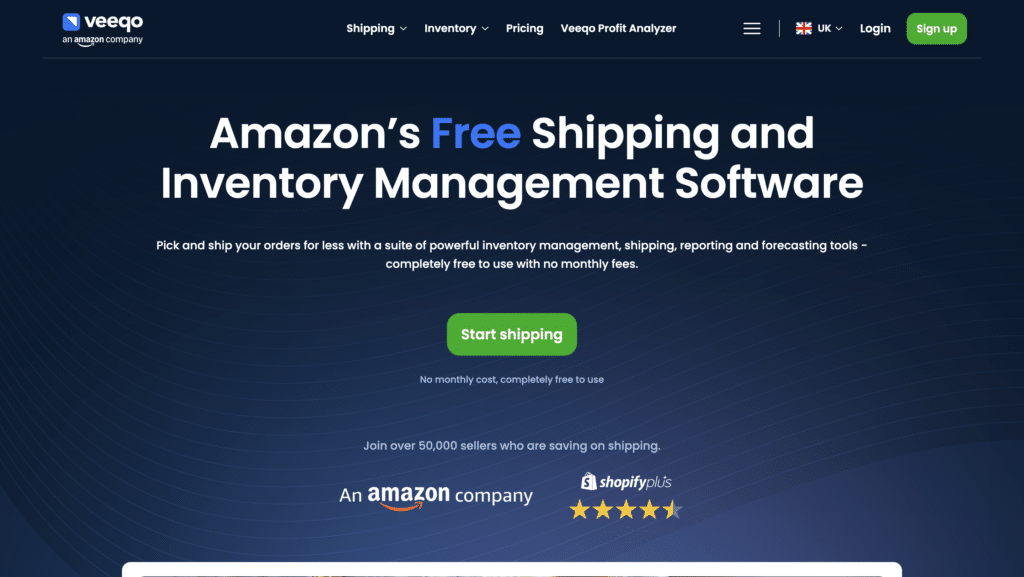
Veeqo is a multichannel inventory management and shipping platform for e-commerce.
What are their standout website features?
They centralise inventory tracking across marketplaces like Amazon, eBay, and Shopify. Their shipping automation rules save time, and real-time stock updates prevent overselling.
Takeaways to upgrade your website with:
- Combine inventory from multiple sales channels in one place
- Provide shipping automation with clear rule sets
- Use real-time stock updates to avoid mistakes
- Offer direct integrations with major marketplaces
81. Beamer (New entrant)
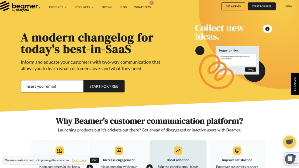
Beamer is a changelog and announcement tool that integrates into websites or apps.
What are their standout website features?
They let teams post product updates, news, or special offers in a sidebar or notification widget. Engagement analytics show which announcements users interact with most.
Takeaways to upgrade your website with:
- Offer a clean, unobtrusive way to announce updates
- Track engagement on each announcement
- Provide a quick, no-code setup for easy deployment
- Use a friendly widget design that fits existing branding
82. LaunchDarkly (New entrant)
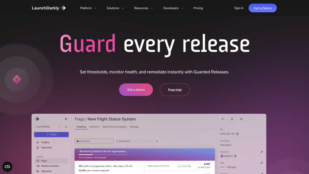
LaunchDarkly offers feature flag management for developers, enabling controlled rollouts and A/B testing.
What are their standout website features?
They promote safe deployment by letting teams turn features on or off without redeploying code. The homepage clearly explains how this reduces risk and speeds up experimentation.
Takeaways to upgrade your website with:
- Emphasise risk reduction in feature deployment
- Highlight toggles for quick rollbacks and testing
- Use clear visuals to show how feature flags work
- Promote a data-driven approach to new releases
83. Optimizely (New entrant)
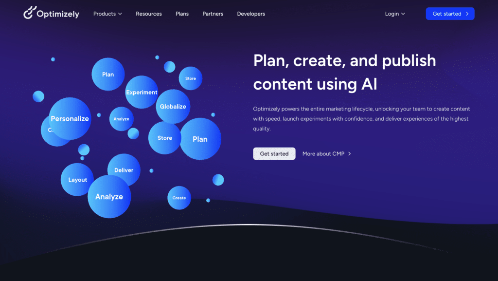
Optimizely provides experimentation and personalisation tools for websites and apps.
What are their standout website features?
They feature a drag-and-drop visual editor for A/B tests, plus robust analytics for measuring conversion lifts. Enterprise customers can scale tests across multiple digital properties.
Takeaways to upgrade your website with:
- Include easy A/B test setup for non-technical teams
- Offer detailed analytics on conversion impact
- Scale personalisation features for large sites
- Keep the interface approachable while offering advanced options
84. VWO (New entrant)
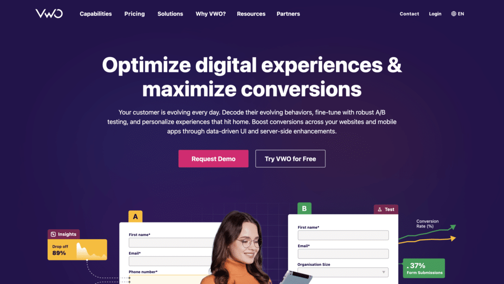
VWO (Visual Website Optimizer) is a testing and conversion optimisation platform.
What are their standout website features?
They provide A/B, multivariate, and split URL testing with an intuitive visual editor. Heatmaps and click-tracking add context to test outcomes. Clear documentation helps novices get started.
Takeaways to upgrade your website with:
- Offer multiple testing methods for different needs
- Incorporate heatmaps to interpret user behaviour
- Keep documentation accessible for all skill levels
- Focus on a user-friendly interface for test creation
85. Crazy Egg (New entrant)
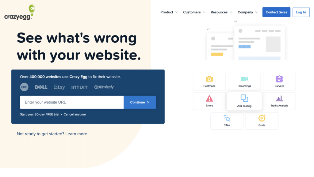
Crazy Egg offers heatmaps, scrollmaps, and A/B testing for website optimisation.
What are their standout website features?
They highlight easy installation and an intuitive heatmap interface that reveals exactly where users click. Basic A/B tests can be launched directly from the dashboard without heavy coding.
Takeaways to upgrade your website with:
- Use visual data to pinpoint user focus
- Offer lightweight A/B testing for fast experiments
- Keep setup easy to encourage adoption
- Combine heatmaps with direct site editing tools
86. OneSignal (New entrant)
OneSignal is a push notification service for websites and mobile apps.
What are their standout website features?
They emphasise segmentation and personalisation, letting businesses send timely notifications based on user behaviour. Clear documentation shows how to embed push notifications quickly.
Takeaways to upgrade your website with:
- Offer granular segmentation for targeted messaging
- Provide straightforward setup instructions and code snippets
- Emphasise how timely notifications boost re-engagement
- Include analytics on open rates and delivery
87. PushEngage (New entrant)
PushEngage delivers browser push notifications for websites looking to re-target visitors.
What are their standout website features?
They offer automated drip campaigns, allowing multiple notifications over time. Advanced targeting rules help send relevant messages, such as cart abandonment prompts for e-commerce.
Takeaways to upgrade your website with:
- Use drip campaigns for re-engaging site visitors
- Target users based on behaviour or page visits
- Show case studies on improved conversion rates
- Keep the UI simple for non-technical marketers
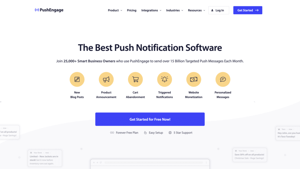
88. WP Engine (New entrant)
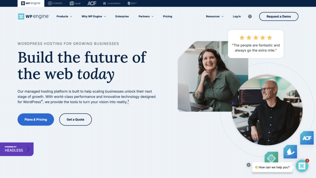
WP Engine is a managed WordPress hosting platform offering speed, security, and scalability.
What are their standout website features?
They focus on optimised WordPress performance, staging areas for testing changes, and strong security measures. Case studies highlight how sites load faster and handle traffic spikes with ease.
Takeaways to upgrade your website with:
- Emphasise performance improvements for WordPress
- Provide staging environments for safe updates
- Use security certifications to build trust
- Show real-world examples of uptime and speed gains
89. Kinsta (New entrant)
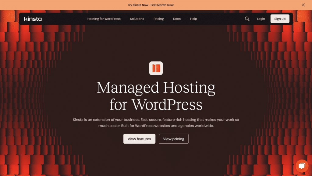
Kinsta is another managed WordPress hosting service known for Google Cloud infrastructure.
What are their standout website features?
They highlight performance with server-level caching and automatic scaling. A user-friendly dashboard helps novices manage their WordPress sites, while advanced dev tools cater to pros.
Takeaways to upgrade your website with:
- Use robust cloud infrastructure for reliability
- Offer a clean dashboard for all user levels
- Keep performance and caching front and centre
- Include developer-friendly tools where relevant
90. Flywheel (New entrant)
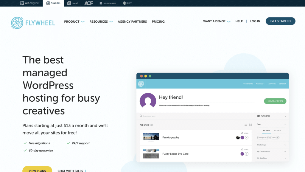
Flywheel provides managed WordPress hosting with a focus on design agencies and freelancers.
What are their standout website features?
Their site positions collaboration tools that let designers hand off projects seamlessly. Built-in staging, nightly backups, and a stylish interface appeal to creatives.
Takeaways to upgrade your website with:
- Focus on design-friendly workflows for agencies
- Highlight staging environments and automated backups
- Use a stylish interface that resonates with creatives
- Emphasise smooth collaboration and handoff
91. Typeform VideoAsk (New entrant)
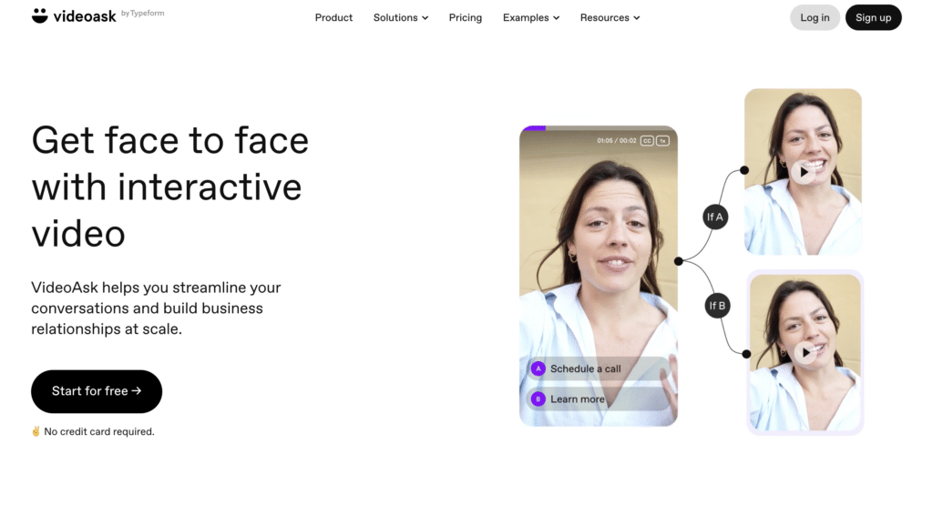
Typeform VideoAsk allows users to create video-based forms and Q&A experiences.
What are their standout website features?
They emphasise human interaction by letting questioners record short videos. Respondents reply with video or text, creating an engaging conversation. Integrations with CRMs capture leads seamlessly.
Takeaways to upgrade your website with:
- Use video to personalise interactions
- Offer multiple response methods (video or text)
- Integrate with CRM systems for lead collection
- Keep the interface simple despite media elements
92. Livestorm (New entrant)
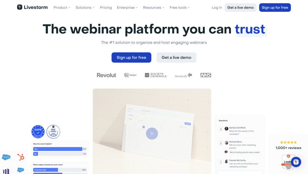
Livestorm is a browser-based webinar and virtual meeting platform.
What are their standout website features?
They stress a no-download experience, running webinars directly in the browser. Automated emails and analytics help track engagement, while user-friendly registration pages simplify sign-ups.
Takeaways to upgrade your website with:
- Highlight ease of entry (no software download)
- Provide automated email sequences for participants
- Track engagement metrics in real time
- Keep the onboarding flow smooth for both hosts and attendees
93. Demio (New entrant)
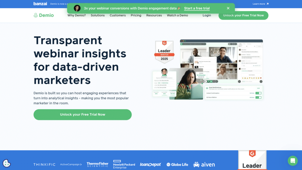
Demio is a webinar hosting platform focused on live, automated, and on-demand sessions.
What are their standout website features?
They highlight quick setup for live events, with replays that can be automated later. Interactive features like polls and chat help keep audience engagement high.
Takeaways to upgrade your website with:
- Offer multiple webinar formats (live, on-demand, hybrid)
- Use interactive elements to maintain attention
- Store replays for automated funnels or future viewing
- Use a clear scheduling interface for easy event creation
94. Hopin (New entrant)
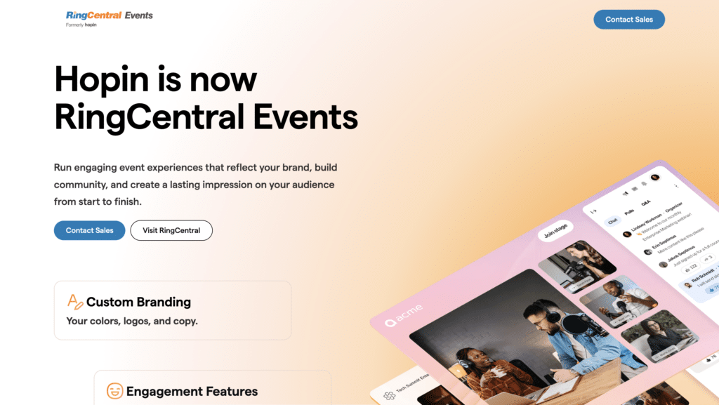
Hopin is a virtual event platform hosting conferences, trade shows, and networking sessions online.
What are their standout website features?
They merge multiple virtual spaces—stage, expo, sessions, and networking. Interactive chat and audience Q&A drive engagement, while analytics show session attendance and participant behaviour.
Takeaways to upgrade your website with:
- Create distinct virtual “areas” to replicate real events
- Include audience interaction tools (chat, polls, Q&A)
- Show analytics on user participation and session engagement
- Keep navigation clear for large-scale events
95. Gather (New entrant)
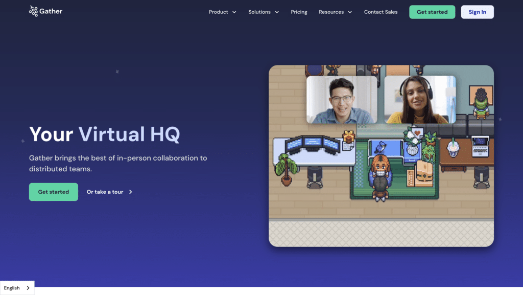
Gather offers a virtual space platform with a gamified, pixel-art environment for remote meetups.
What are their standout website features?
They stand out by letting users walk around 2D virtual venues, interacting only when avatars get close. This fosters organic networking, with custom maps for conferences or office layouts.
Takeaways to upgrade your website with:
- Use a unique, playful design to stand apart
- Encourage spontaneous interactions via proximity chat
- Provide customisable map templates
- Support multiple event types (team building, conferences)
96. MURAL (New entrant)
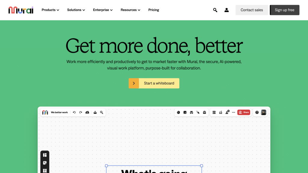
MURAL is an online whiteboard platform geared towards visual collaboration and design thinking.
What are their standout website features?
They emphasise sticky notes, diagramming, and real-time co-creation. Templates for agile ceremonies, brainstorming, and strategy mapping speed up team alignment.
Takeaways to upgrade your website with:
- Offer a digital sticky note environment for visual brainstorming
- Focus on collaboration features for remote or hybrid teams
- Include multiple built-in templates for standard processes
- Use bright visuals to keep it engaging
97. Lucidspark (New entrant)
Lucidspark is another digital whiteboard from Lucid, designed for ideation and collaboration.
What are their standout website features?
They integrate smoothly with Lucidchart for building polished diagrams after brainstorming. Quick voting and timer tools help run structured sessions, especially for distributed teams.
Takeaways to upgrade your website with:
- Focus on rapid brainstorming and idea generation
- Provide voting features to prioritise concepts
- Include a timer for structured sprints
- Leverage integration with complementary tools (like Lucidchart)
98. ClickMeeting (New entrant)
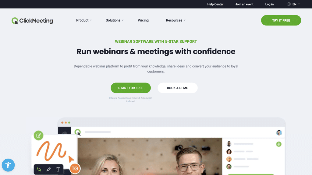
ClickMeeting offers webinars, online meetings, and automated follow-up tools.
What are their standout website features?
They highlight interactive features such as polling, Q&A, and live chat. An automated webinar mode lets businesses pre-record sessions and funnel leads via custom registration pages.
Takeaways to upgrade your website with:
- Combine live and automated webinar options
- Offer interactive tools for audience engagement
- Use custom registration pages to capture leads
- Keep analytics central to measure success
99. Zoom Events (New entrant in the 100 best SaaS websites)
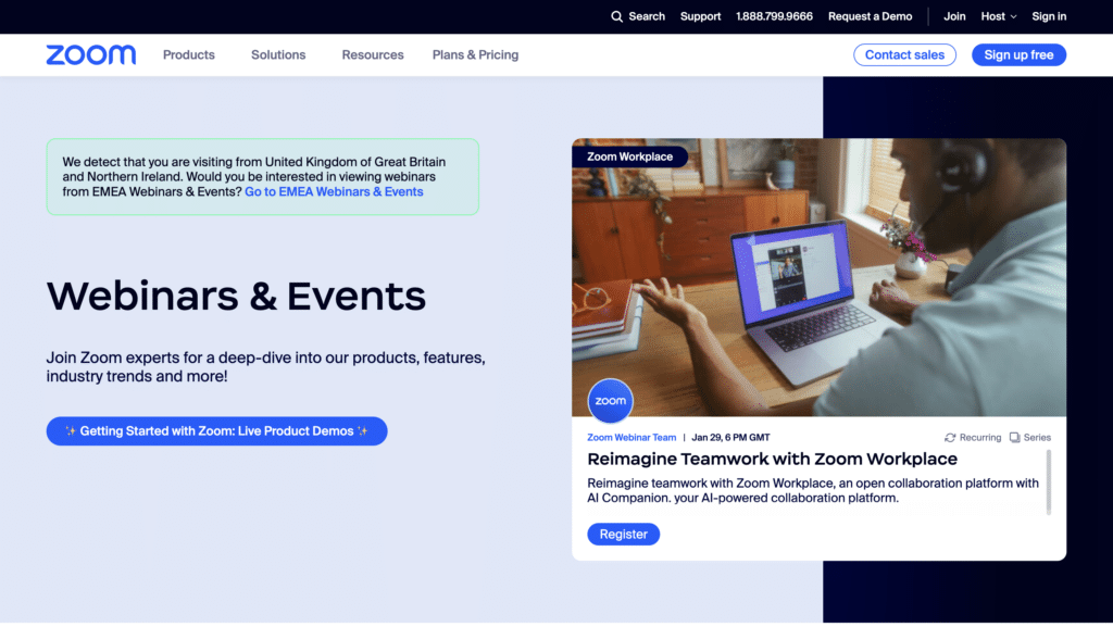
Zoom Events expands Zoom’s video conferencing into a virtual event hosting platform.
What are their standout website features?
They emphasise multi-session events, ticketing, and custom branding. Organisers can host conferences with breakout sessions, plus track attendee engagement through post-event analytics.
Takeaways to upgrade your website with:
- Repurpose a familiar video tool for event hosting
- Provide ticketing and attendee management in one place
- Enable custom branding to match the event’s identity
- Offer post-event analytics on attendance and engagement
100. WebinarJam (New entrant)
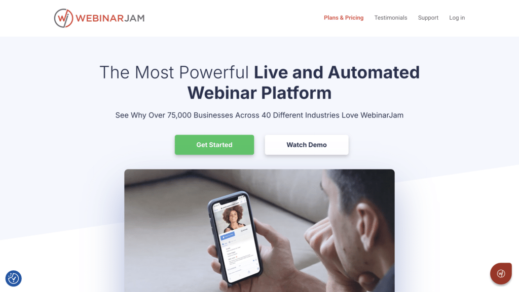
WebinarJam is a webinar platform that focuses on ease of setup and automated replays.
What are their standout website features?
They showcase high attendee capacity, interactive features like polls and live chat, and simple replay automation. Marketing tools such as custom registration funnels and email reminders boost conversions.
Takeaways to upgrade your website with:
- Emphasise straightforward webinar setup for large audiences
- Include marketing tools for nurturing registrants
- Provide interactive elements to hold attention
- Offer on-demand replays to extend reach
Final Thoughts
In our comprehensive overview of the best SaaS websites, one core principle stands out: customers judge your brand’s value based on the ease of understanding and interaction on your homepage. This is particularly important in B2B contexts, where your target audience is searching for effective solutions to complex challenges. Whether you’re showcasing a developer tool, a collaboration platform, or a marketing automation service, simplicity, clarity, and engaging design remain pivotal to converting a curious visitor into a loyal user.
Each of the examples here highlights unique methods to connect with potential customers: crisp typography, striking visuals, real-time demos, and concise copy that speaks directly to pain points. Incorporating these elements into your own digital presence not only helps explain your product offering but also fosters immediate trust. While it’s tempting to overload pages with information, the best SaaS websites maintain focus. They select the most compelling features and benefits, pair them with clear calls to action, and weave in social proof—like user testimonials or case studies—to cement credibility.
If you’re looking for deeper insights on how to translate these features into actual results, take a look at our B2B SaaS Marketing Strategy guide for tips on brand positioning, messaging, and lead acquisition. You can also check out our post on B2B SaaS Lead Generation to see how successful SaaS companies are building a pipeline of qualified leads every month. These guides delve into practical methods—like offering valuable content, refining your onboarding process, and leveraging automation—to boost your conversions and drive sustained growth.
By focusing on clear design, relevant messaging, and straightforward navigation, your site can stand among the best SaaS websites in today’s market. Each decision you make—whether it’s shortening copy, adding interactive elements, or highlighting success stories—brings you closer to a user experience that truly resonates. When potential customers can instantly grasp your product’s value, you transform casual browsers into engaged leads, and ultimately, paying customers. By adopting the practices shared throughout this article and diving further into the linked resources, you’ll be poised to differentiate your offering and earn the competitive edge your SaaS brand needs.
Best SaaS Websites FAQs
The most effective SaaS websites incorporate a user-friendly design, clear and compelling value propositions, and intuitive navigation. Key features include:
Free Trials or Demos: Allowing potential customers to experience your product firsthand.
Customer Testimonials and Case Studies: Demonstrating the value and impact of your service.
Comprehensive Support and Resources: Offering easy access to support channels and a rich knowledge base.
Engaging Content: Using blogs, webinars, and tutorials to educate and engage with your audience.
Clear Pricing Information: Providing transparent and detailed pricing plans to help prospects make informed decisions.
To optimise your SaaS website for search engines, focus on:
Keyword Research: Identifying and targeting keywords that potential customers are searching for.
High-Quality Content Creation: Producing valuable content that addresses the needs and questions of your target audience.
On-Page SEO: Ensuring your website's structure, headings, meta descriptions, and images are optimised for your target keywords.
Mobile Responsiveness: Guaranteeing your site provides a seamless experience on mobile devices.
Backlink Building: Earning links from reputable sites within your industry to boost your site's authority.
To enhance your website's conversion rate, implement the following strategies:
A/B Testing: Regularly test different elements of your website (like CTA buttons, headlines, images) to see what works best.
User Experience (UX) Optimisation: Ensure your site is easy to navigate and load times are minimal.
Personalisation: Use data to tailor the website experience to individual users or segments.
Clear Call-to-Actions (CTAs): Make it easy for visitors to know what action to take next, whether it's signing up, requesting a demo, or getting in touch.
Landing Page Optimisation: Create targeted landing pages for different audiences and campaigns to improve relevance and engagement.
Content marketing is crucial for SaaS websites as it helps to educate the target audience, establish authority, and improve search engine rankings. Effective types of content include:
Educational Blog Posts: Addressing common questions and challenges your target audience faces.
Video Tutorials and Demos: Showing your product in action and explaining its benefits.
E-books and Whitepapers: Providing in-depth insights on industry trends or specific challenges.
Case Studies and Success Stories: Highlighting how your product has helped other businesses.
Webinars and Live Q&As: Engaging directly with your audience and providing valuable information.
Measuring the success of your SaaS website involves tracking a variety of metrics, including:
Traffic Sources: Understanding where your visitors are coming from.
Bounce Rate: Identifying pages where visitors leave quickly can highlight content or UX issues.
Conversion Rate: Measuring how effectively your site turns visitors into leads or customers.
Customer Feedback: Collecting and analysing feedback can provide direct insights into user satisfaction and areas for improvement.
Engagement Metrics: Tracking how users interact with your site (such as time on site, pages visited) can help you understand what content is most valuable.
Regular analysis of these metrics will help you refine your strategy and make data-driven decisions to improve your SaaS website.
Reach Your Revenue Goals. Grow MRR with Gripped.
Discover how Gripped can help drive more trial sign-ups, secure quality demos with decision makers and maximise your marketing budget.
Here's what you'll get:
- Helpful advice and guidance
- No sales pitches or nonsense
- No obligations or commitments


Book your free digital marketing review
 30 min session
Other Articles you maybe interested in

SaaS CAC Payback Period: Benchmarks and How to Improve
Master the SaaS CAC payback period with benchmarks and how to improve your efficiency to reinvest in growth and avoid cash-flow crises as you scale to £20M.

B2B SaaS CAC Benchmarks by Industry 2026
Compare your costs against current B2B SaaS CAC benchmarks by industry in 2025 to optimize your marketing spend and scale your ARR more efficiently.

How to Calculate SaaS Marketing ROI: A Step-by-Step Guide
Learn how to calculate SaaS marketing ROI with a step-by-step guide that uncovers hidden costs and ensures your revenue attribution is actually accurate.